


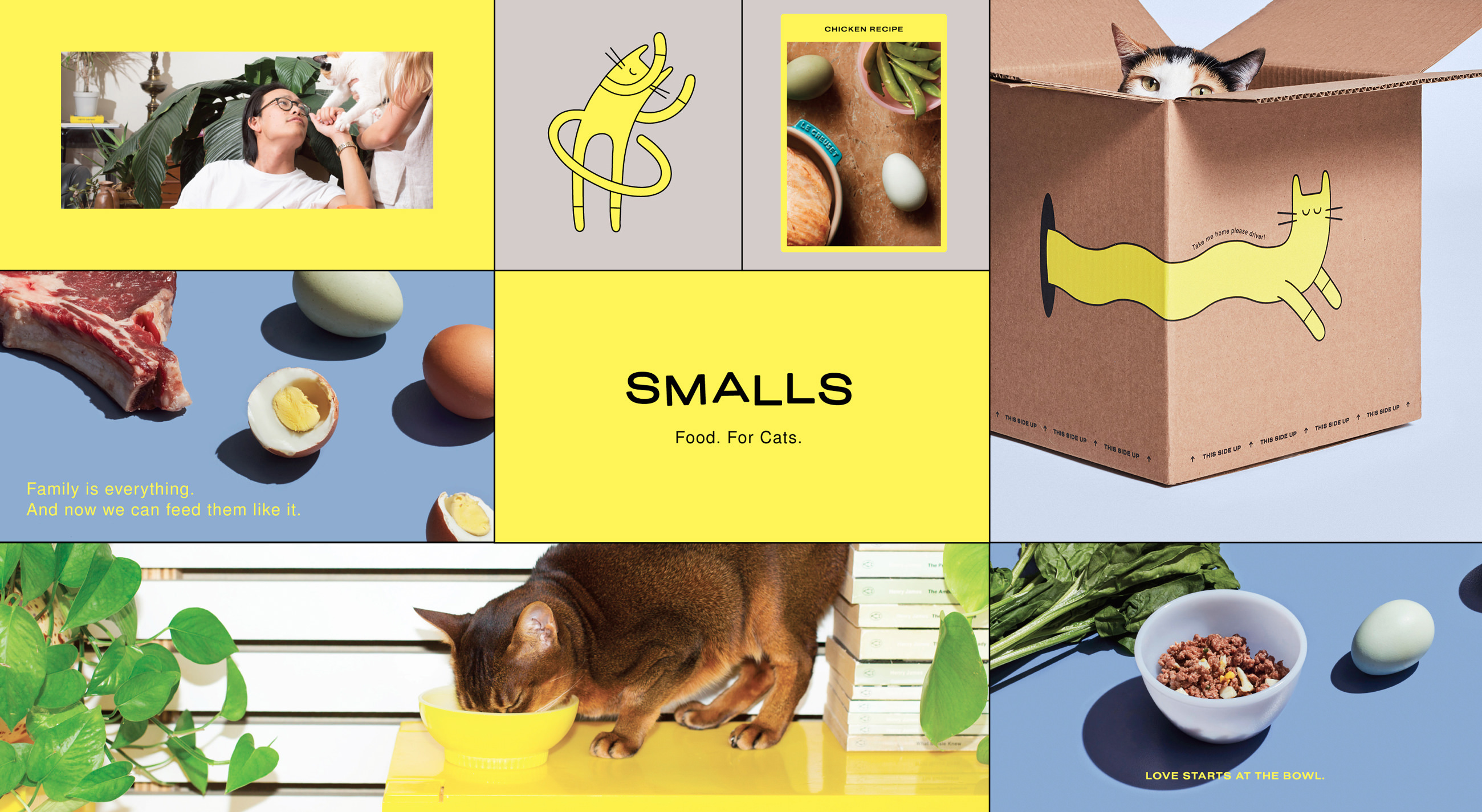
Full identity for Smalls — a new, subscription-based cat food company — including branding, illustration, art direction and styling, website and packaging.
I designed every touchpoint with a focus on the brand's core mission — to get 'back to basics', with human-grade, home-delivered food for cats.
Visit
SMALLSFORSMALLS.COM
PRE-LAUNCH MICROSITE
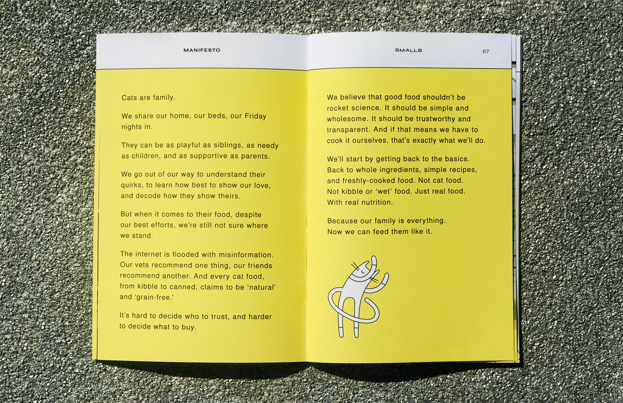
A split-screen splash page — introducing Smalls with a company Manifesto and email capture integration. A Smalls cat follows the user down the page, on all devices and at all breakpoints.
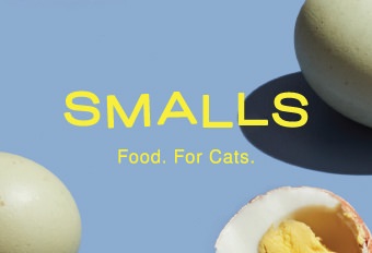
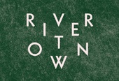
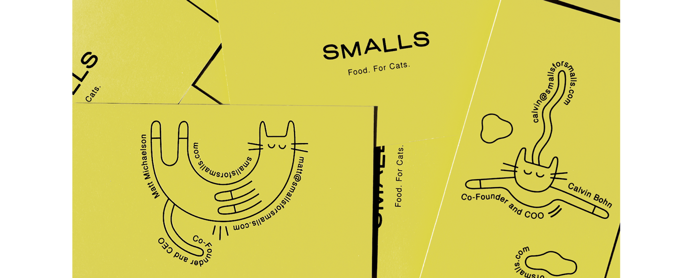
LOGO & TAGLINE
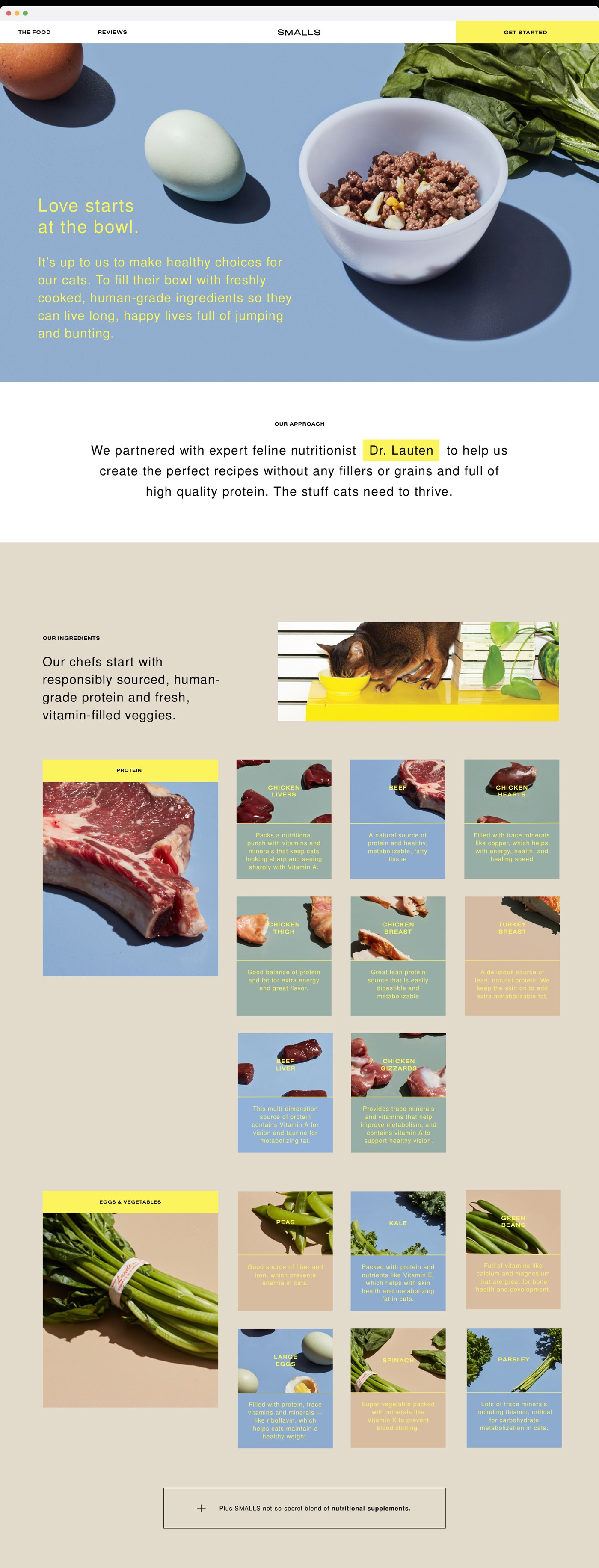
A bold, playful wordmark — mimicking the movements and form of a cat’s body. Re-defining cat food, with a new emphasis on real food.
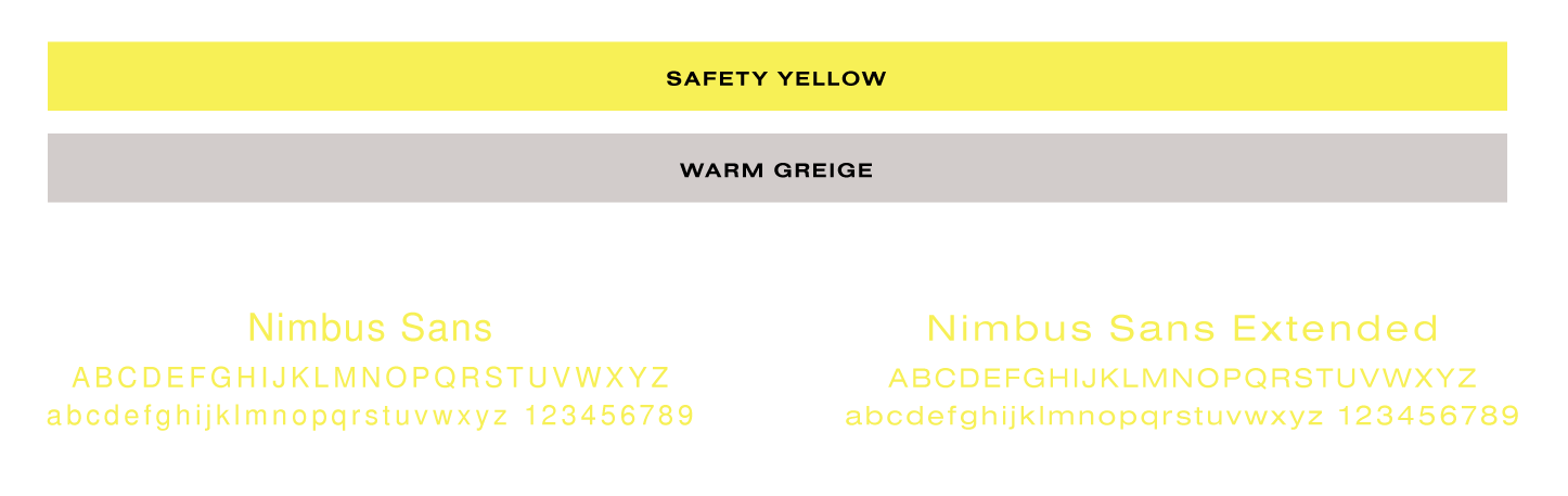
TYPOGRAPHY & COLOR
Dry and pared-back — referencing the brand’s ‘Back to Basics’ values.
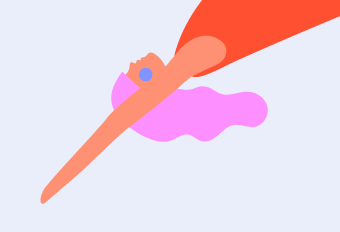
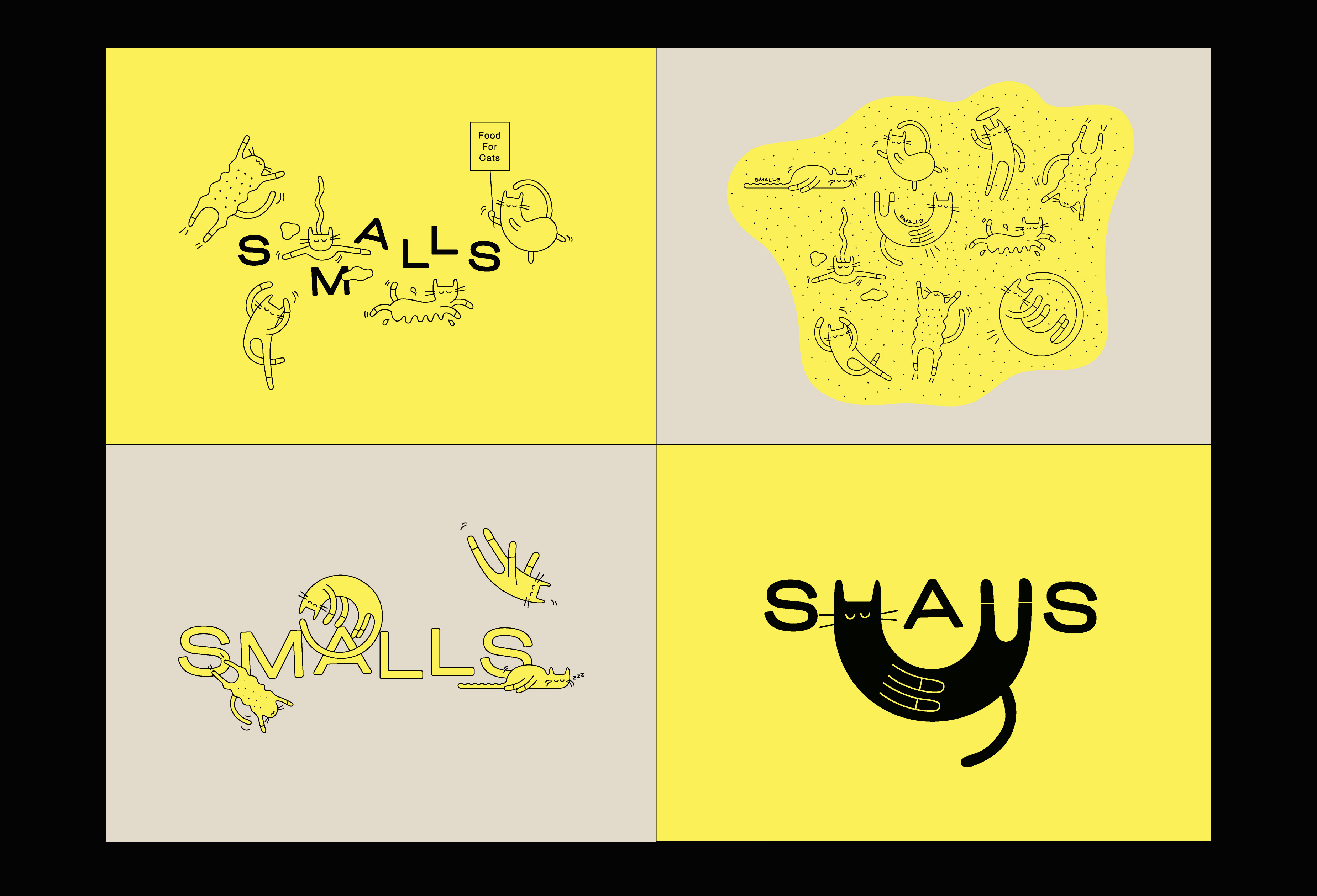
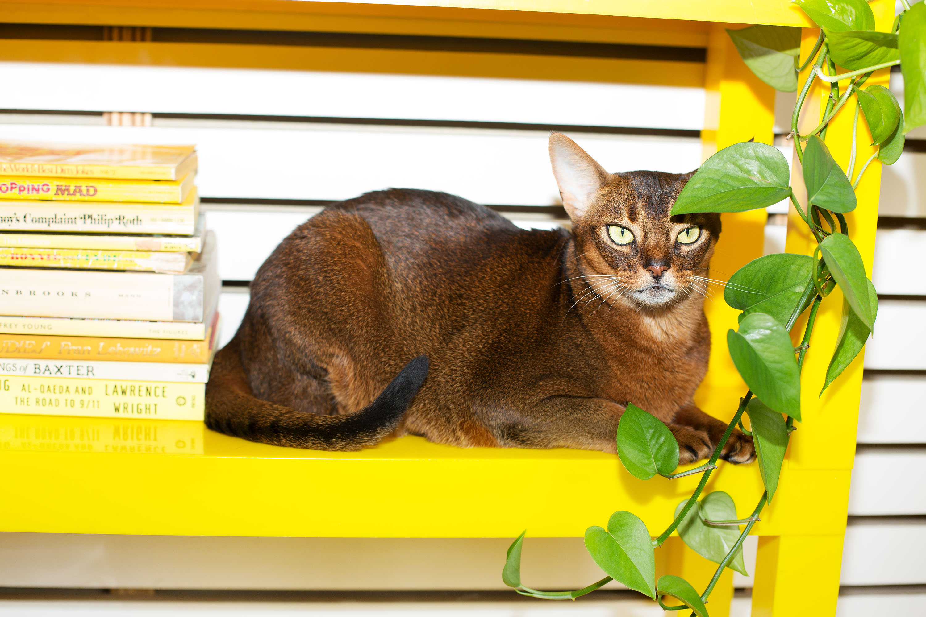
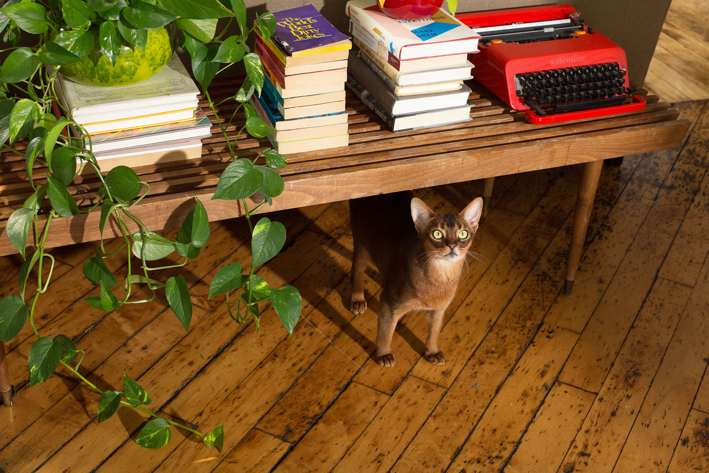
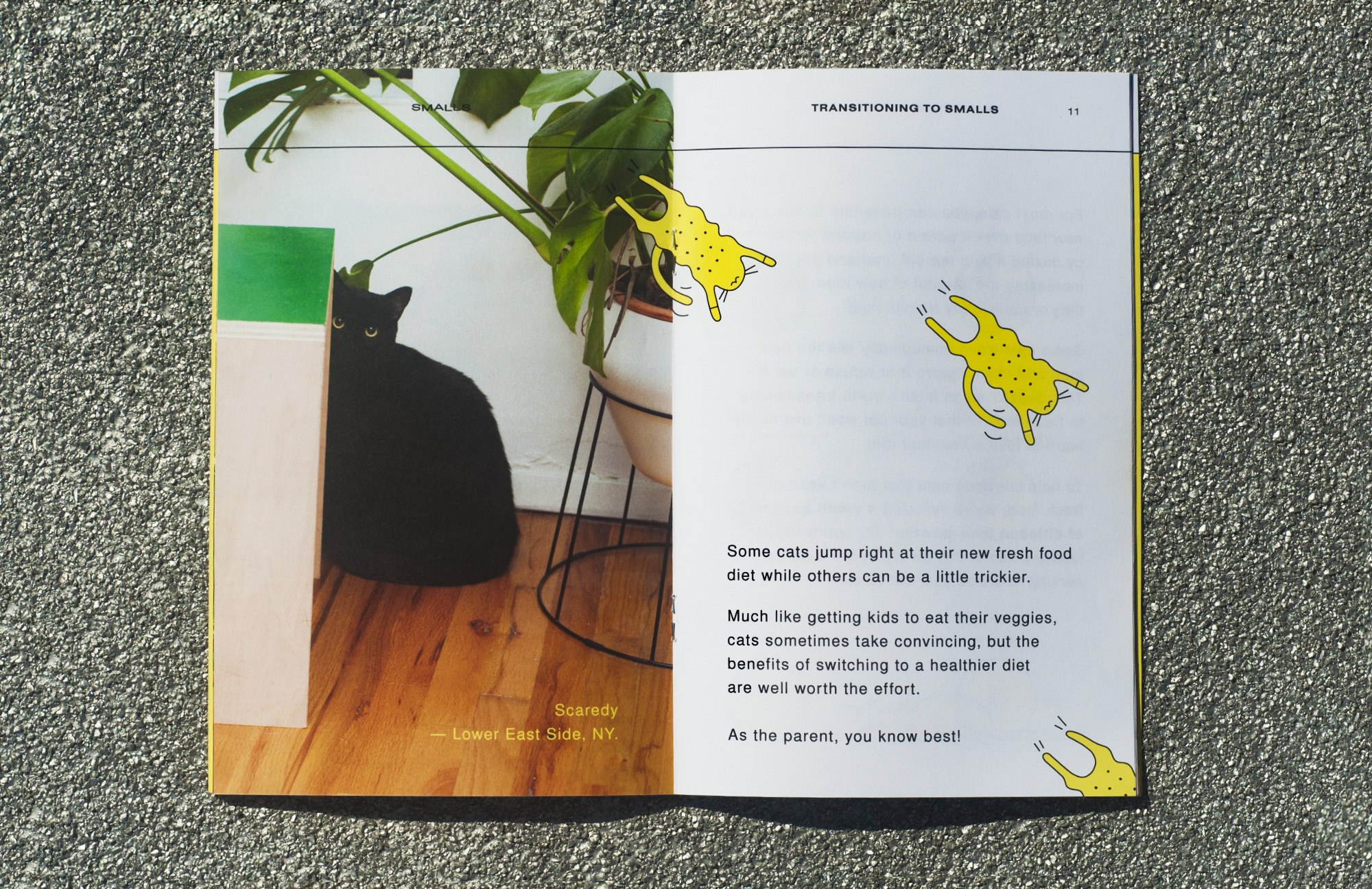
ILLUSTRATION
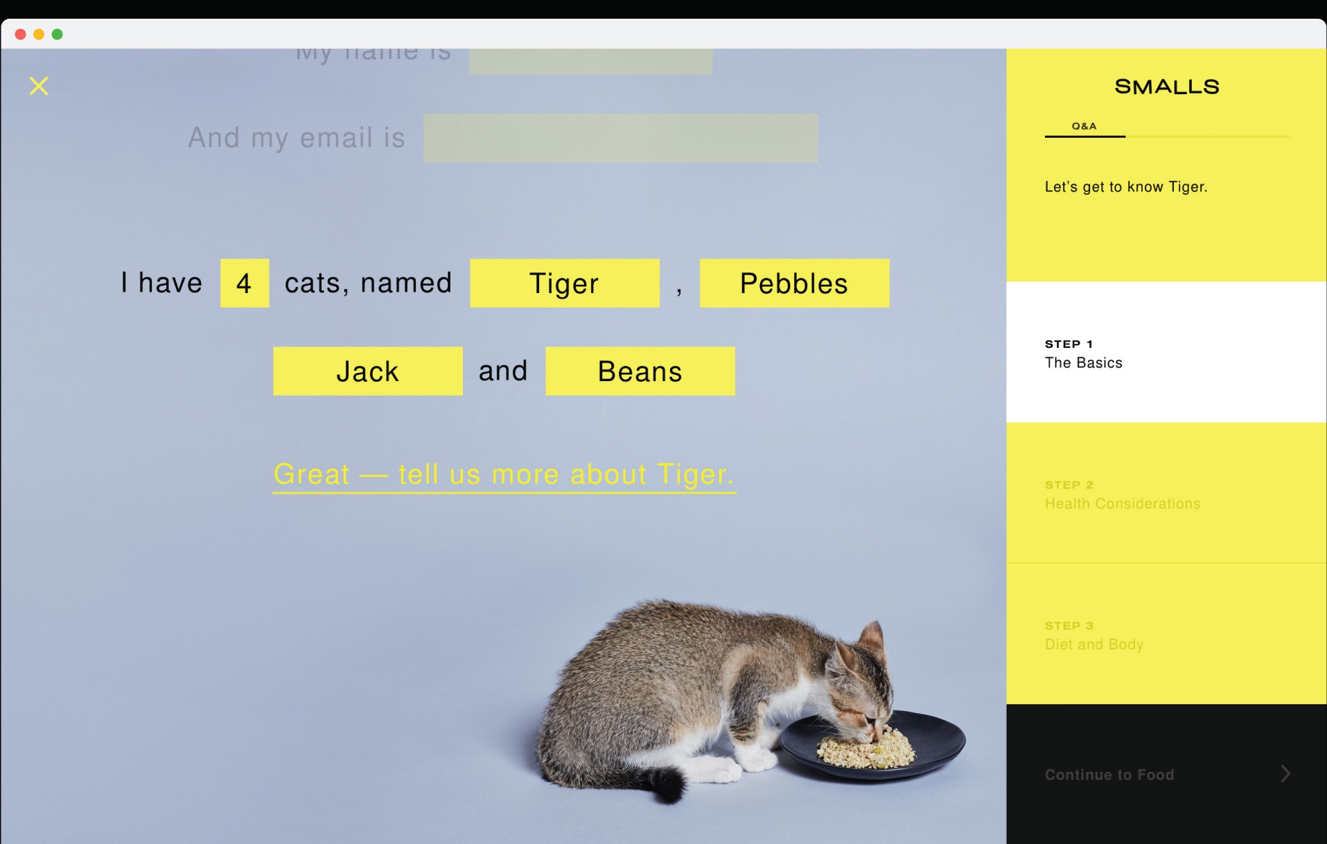
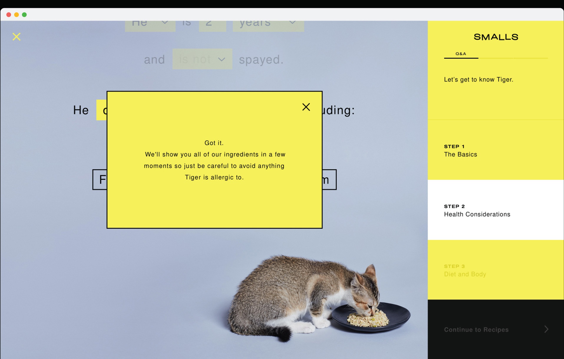
A suite of Smalls cat mascots follows the Smalls customer throughout all brand interactions — bringing messaging to life in a playful and ownable illustrative series.
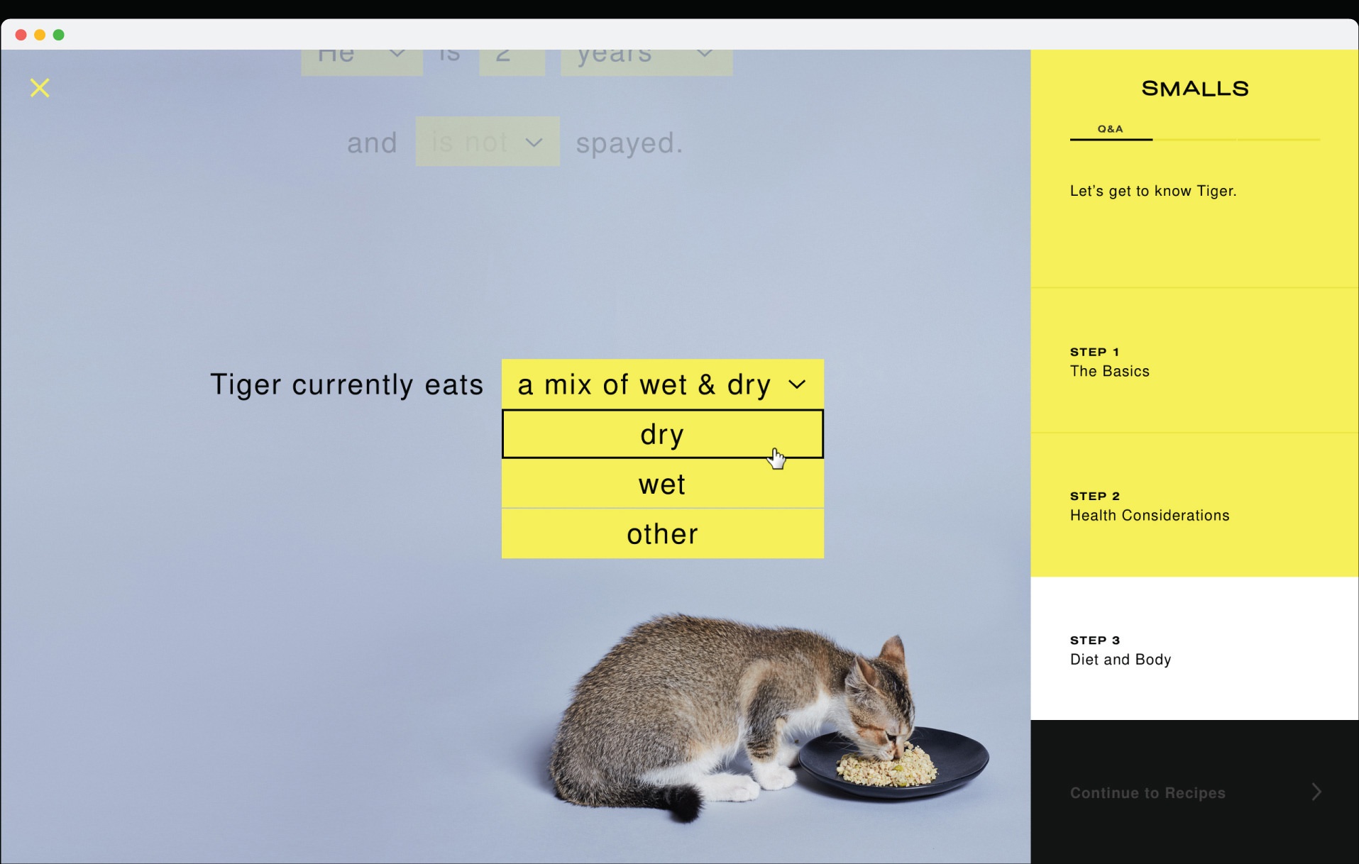
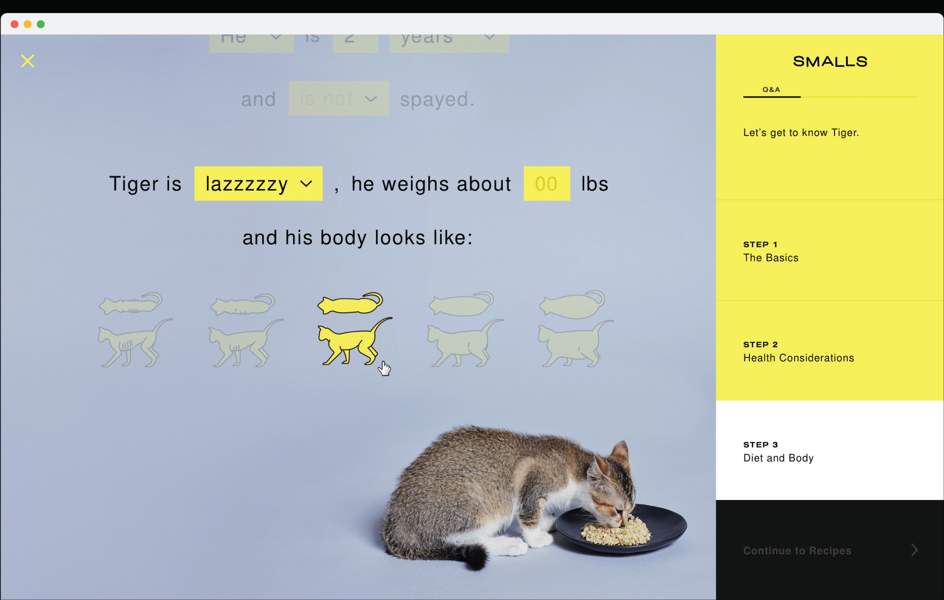
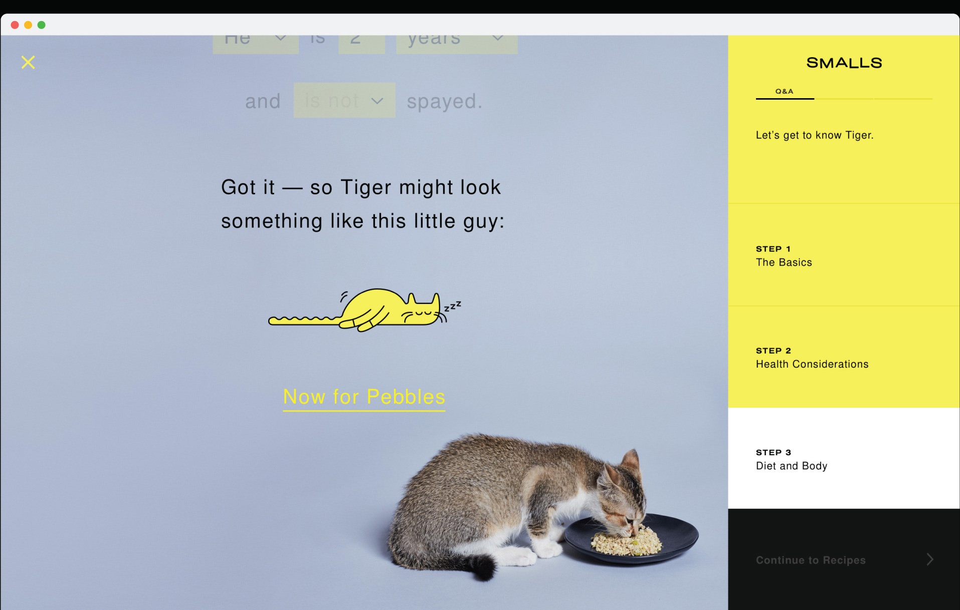
WEBSITE
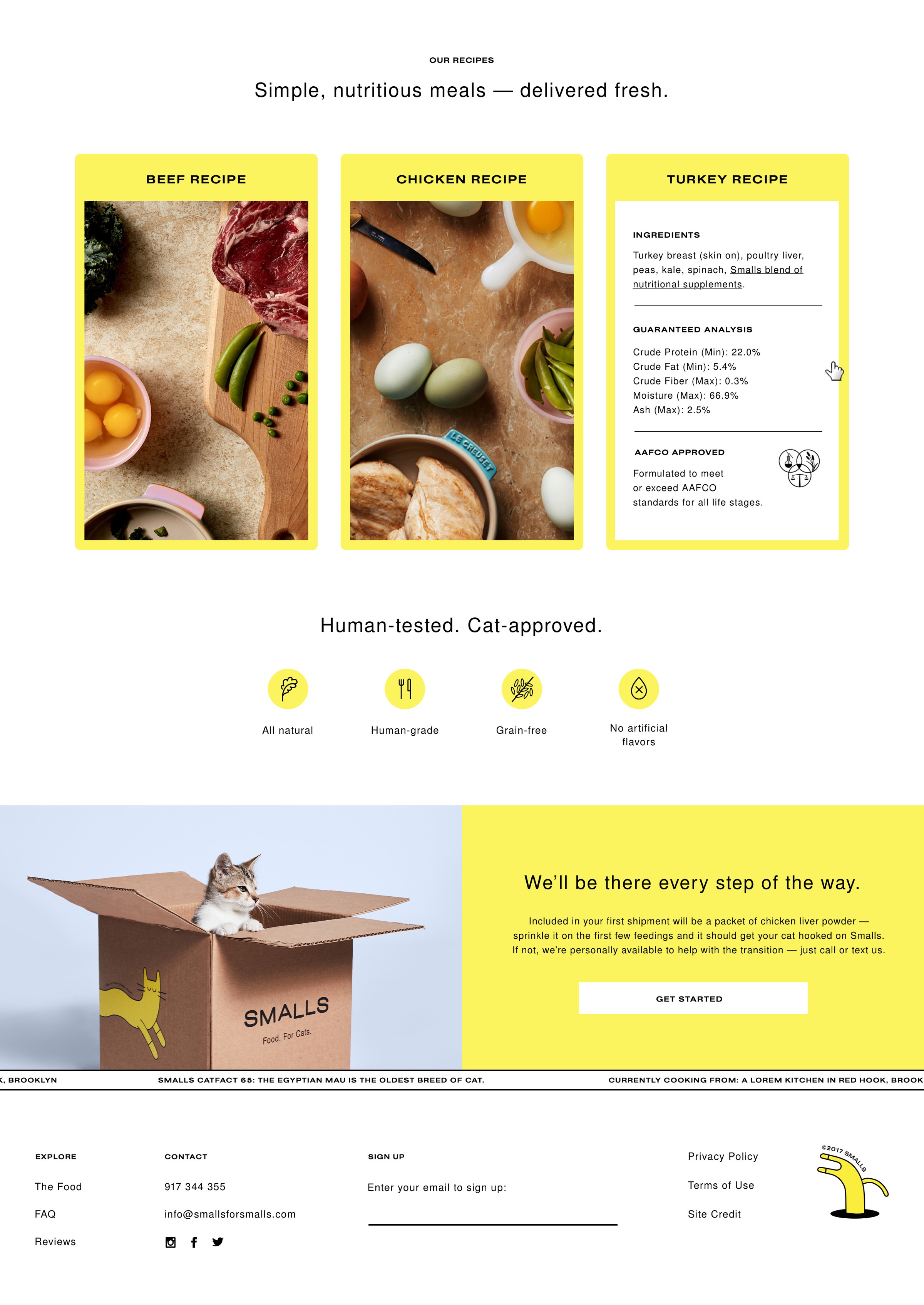
The website weaves together educational content with commerce. Unexpected, playful interactions and rich product storytelling are brought to life with real-world photography and off-beat illustrations.
User onboarding — integrating a custom illustration for each user based on their cat's profile.
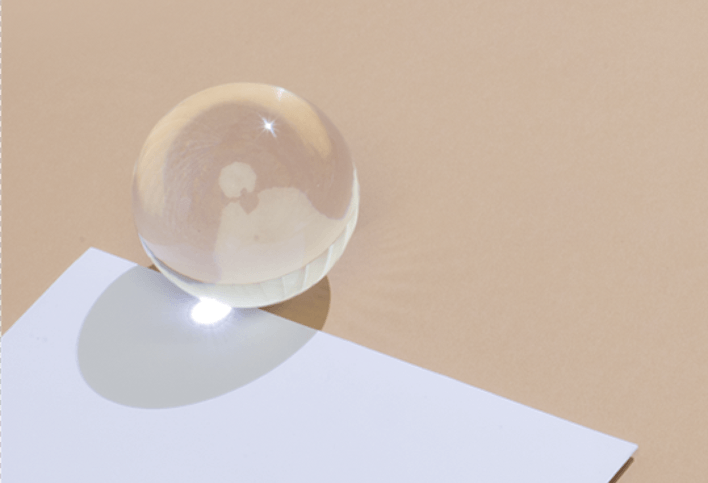
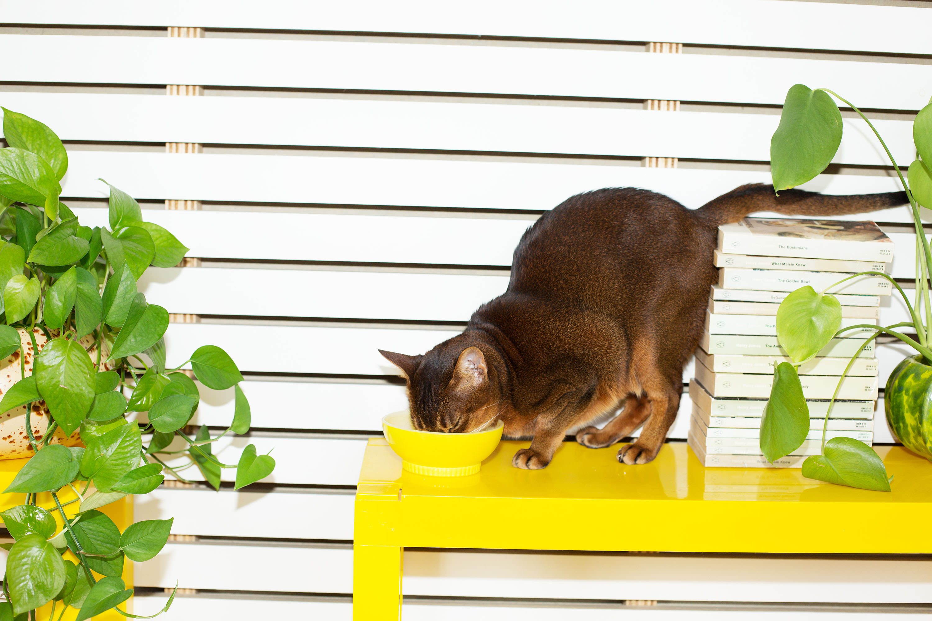
STILL LIFE ART DIRECTION & STYLING
With a desire to bring in a strong sense of reality throughout all brand storytelling, a series of kitchen benchtops was shot to illustrate each of the Smalls recipe ingredients. The images were made to appear as if lit with morning sun to convey a sense of reality and warmth, with 70's-inspired kitchen benchtop surfaces employed to strengthen this idea.
Imperfect, raw and a little messy, props were selected to feel warm but minimal, and a little mismatched — with a mix of 70's plastic, aluminium, enamel and ceramic pieces.
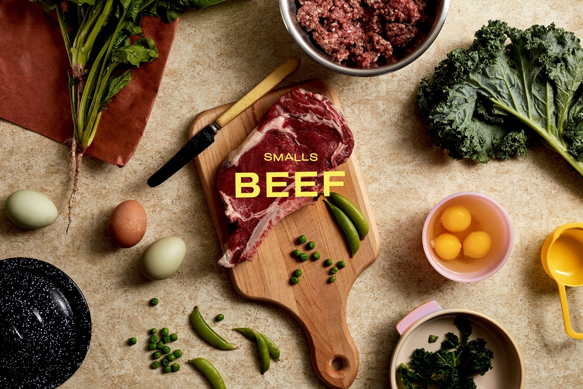
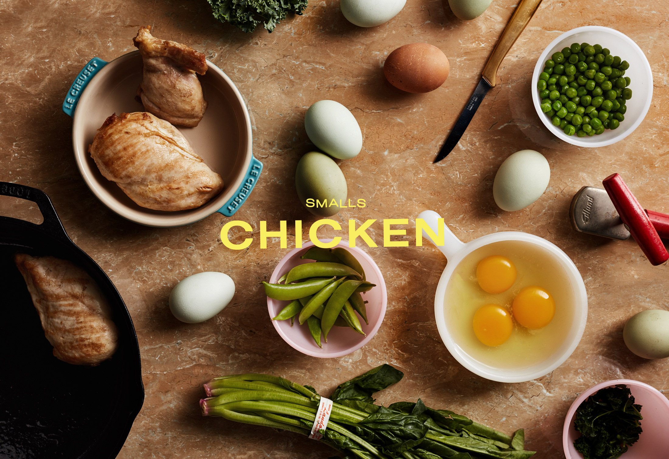
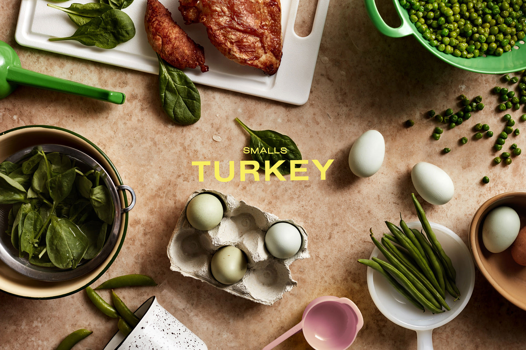
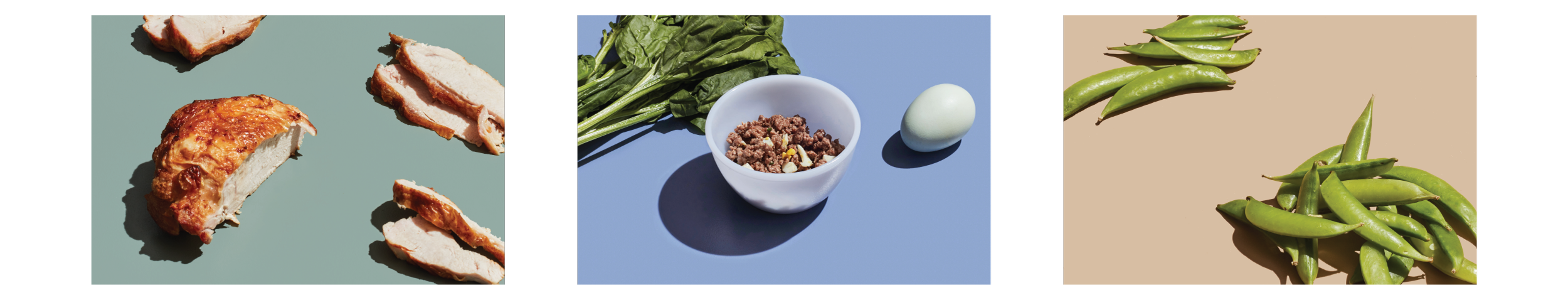
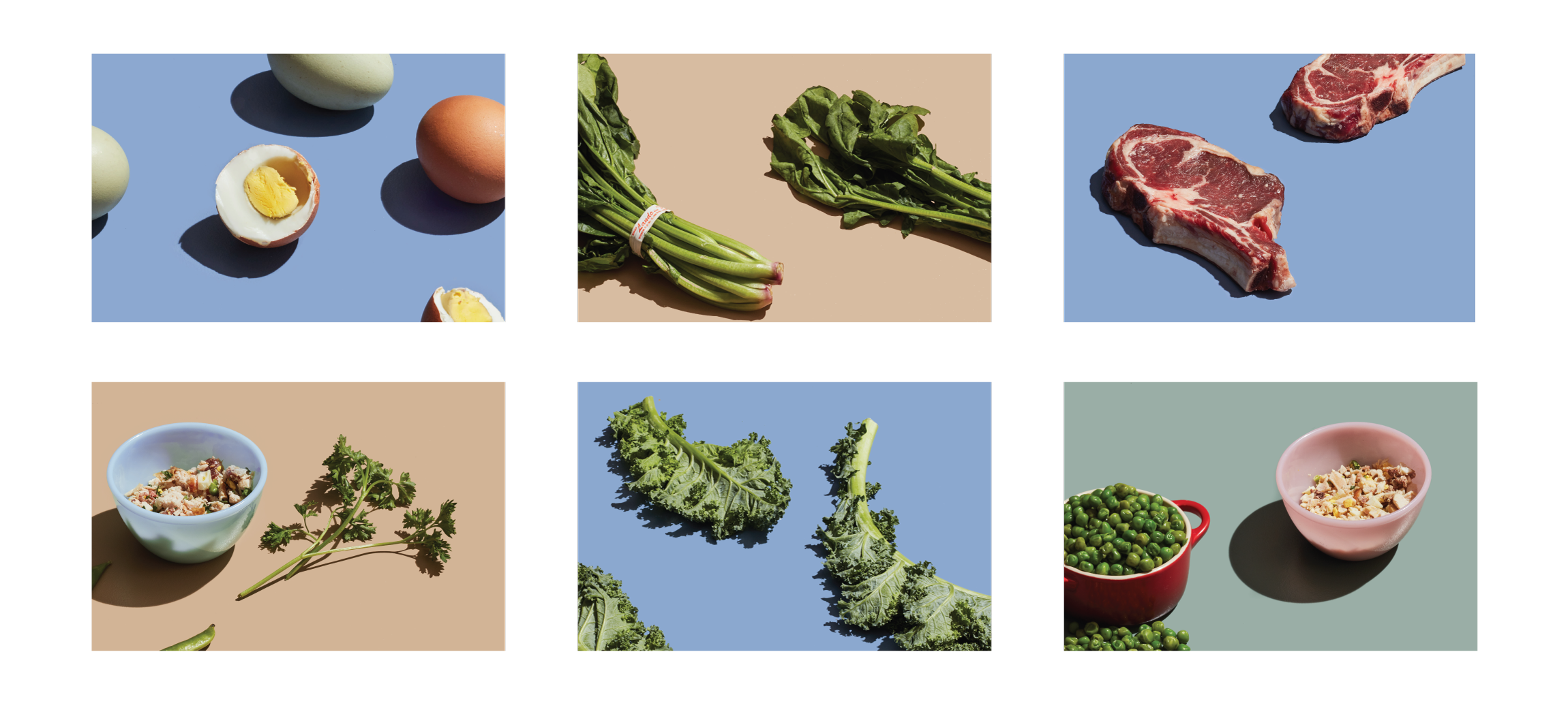
Individual ingredients and recipes were shot more minimally, with harsh lighting — to bring in a sharp, contemporary offset to the brand's photographic styling.
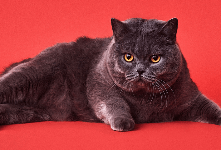
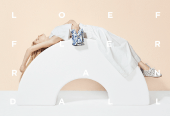
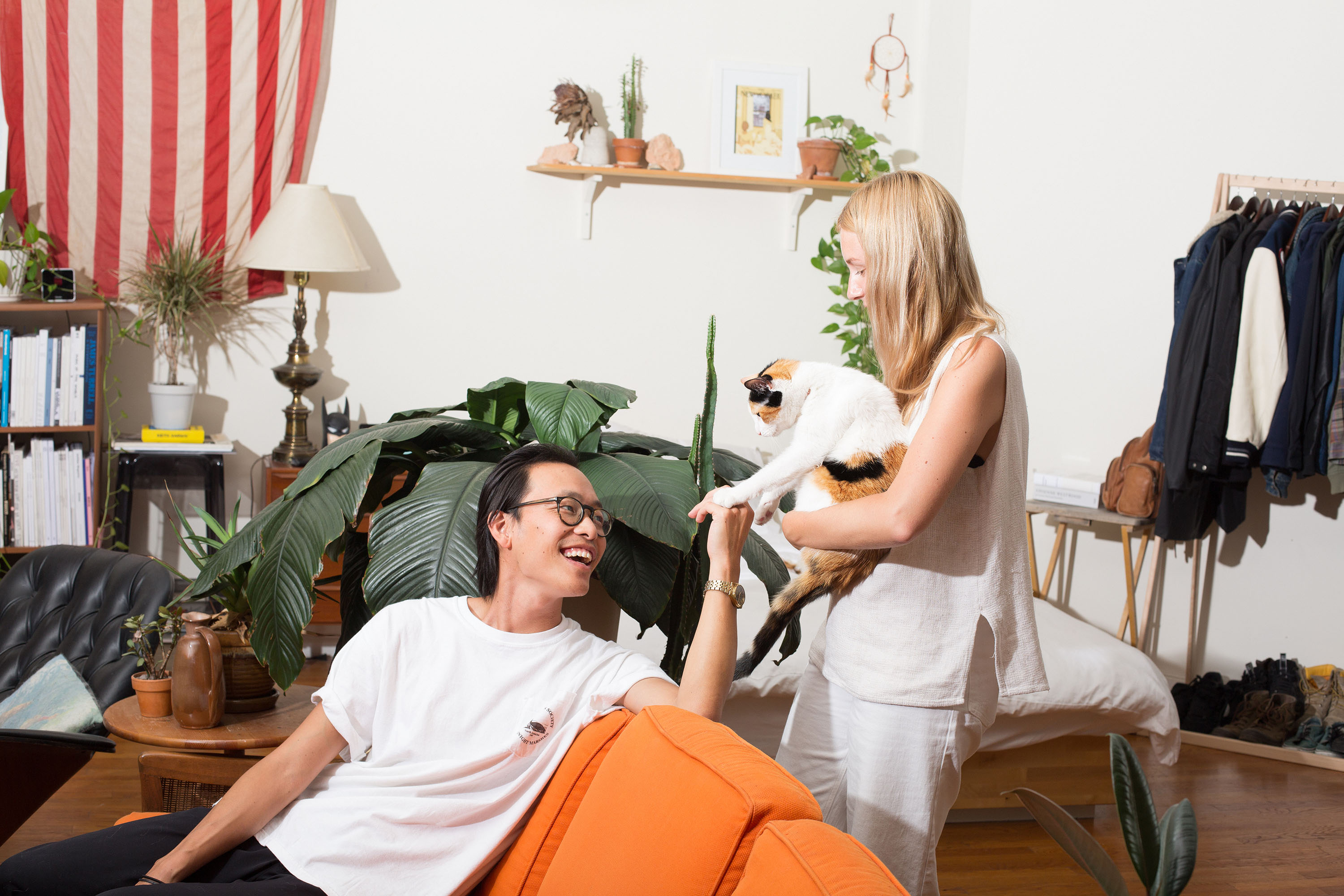
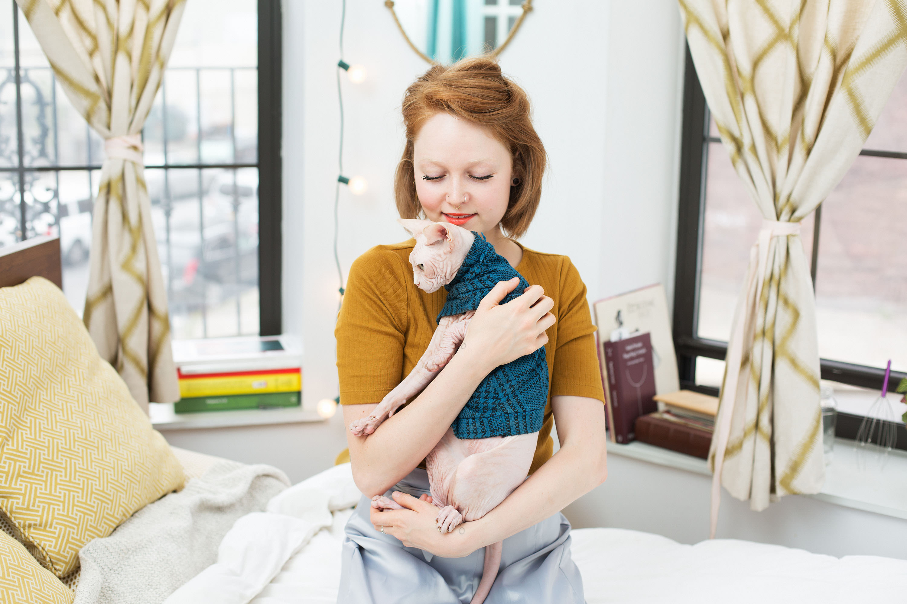
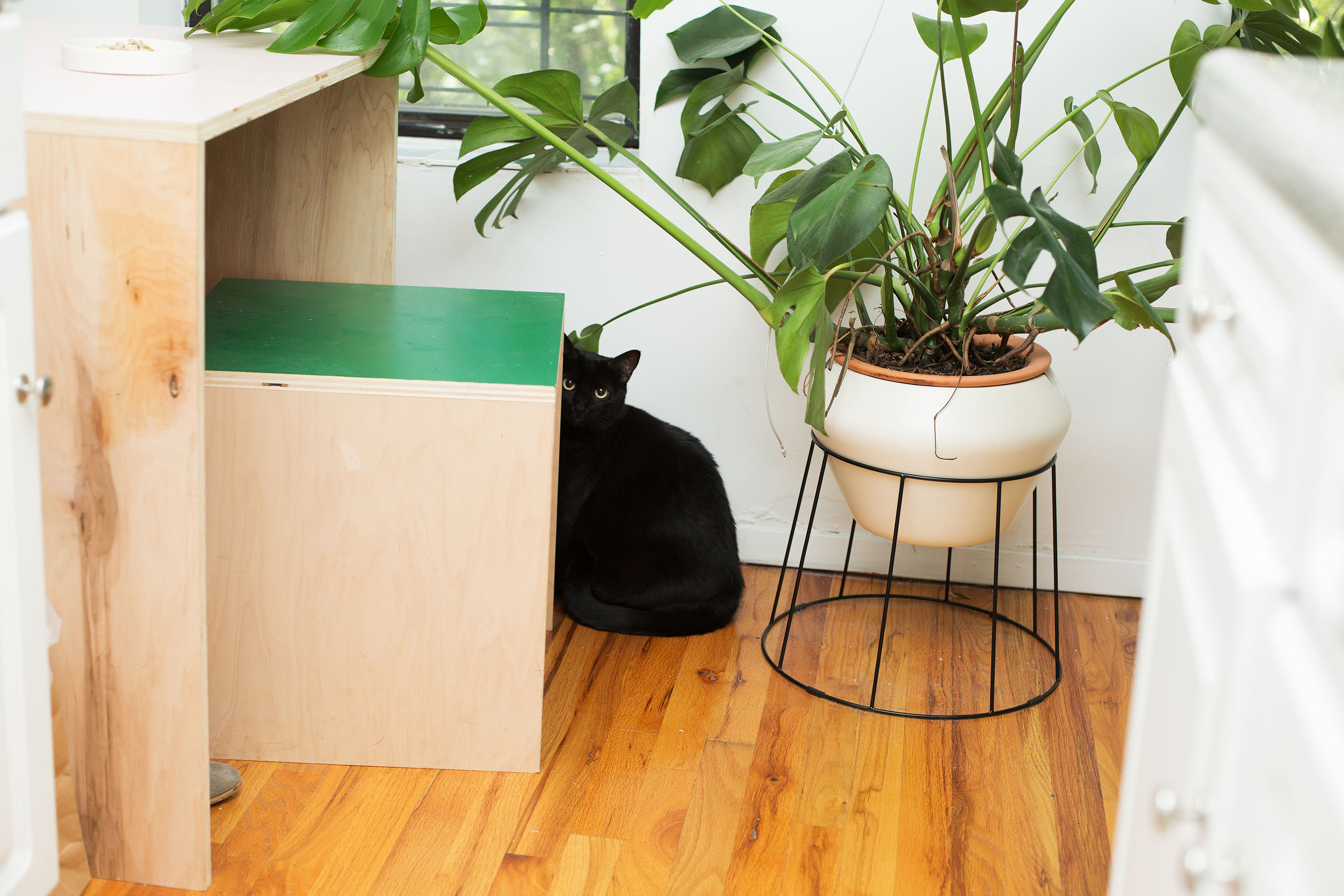
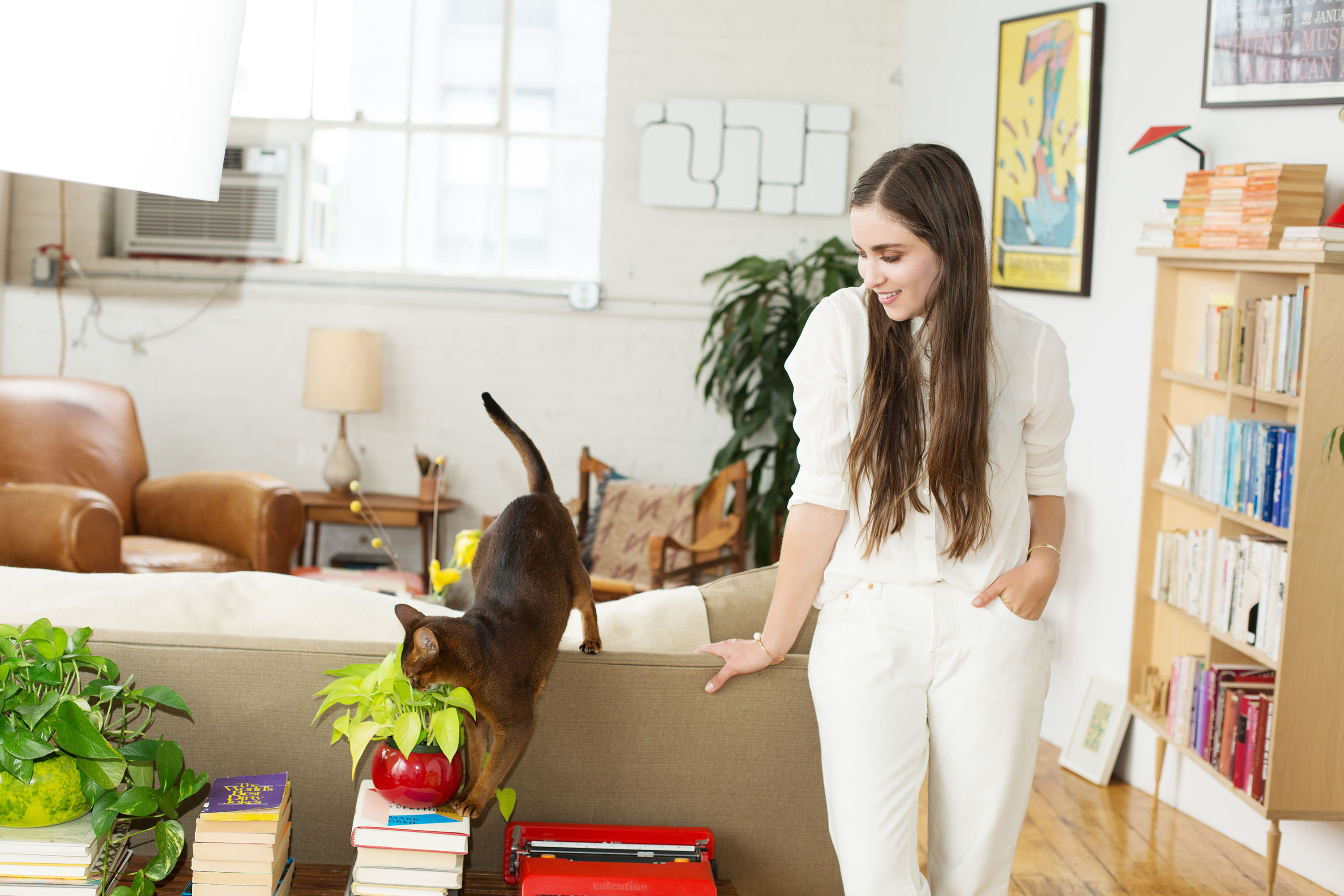
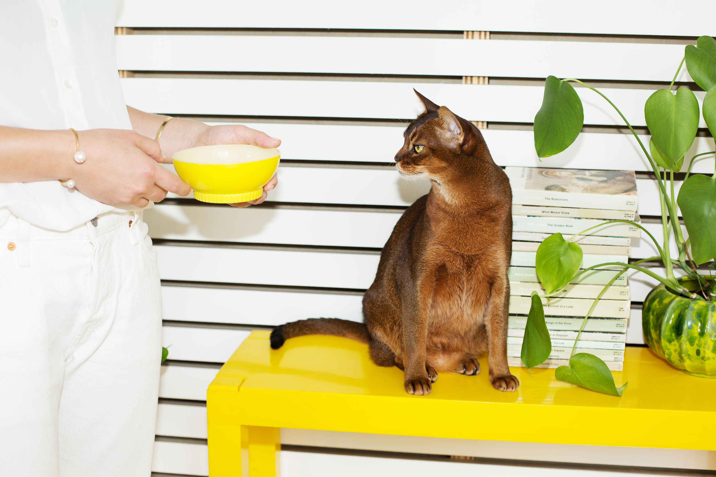
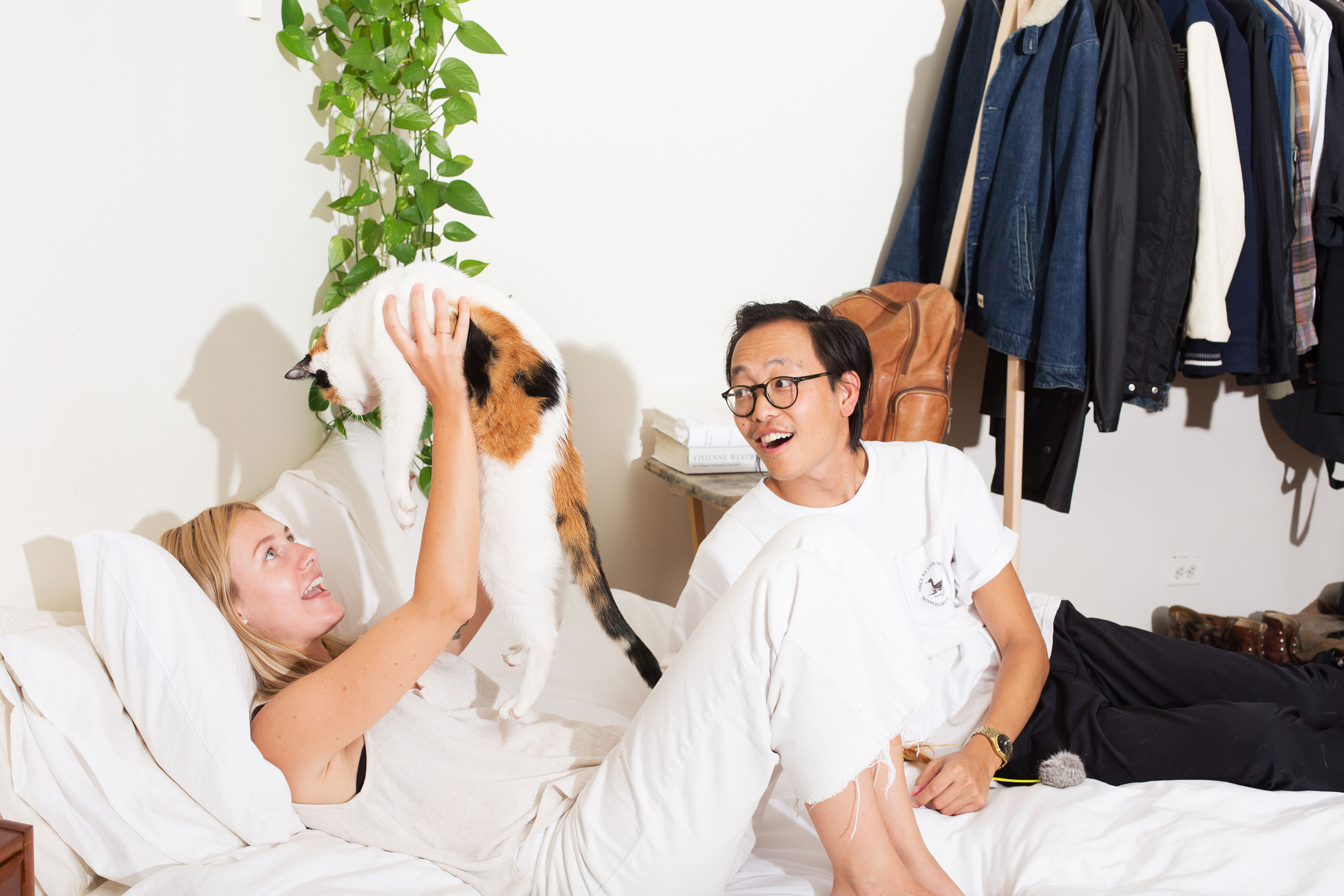
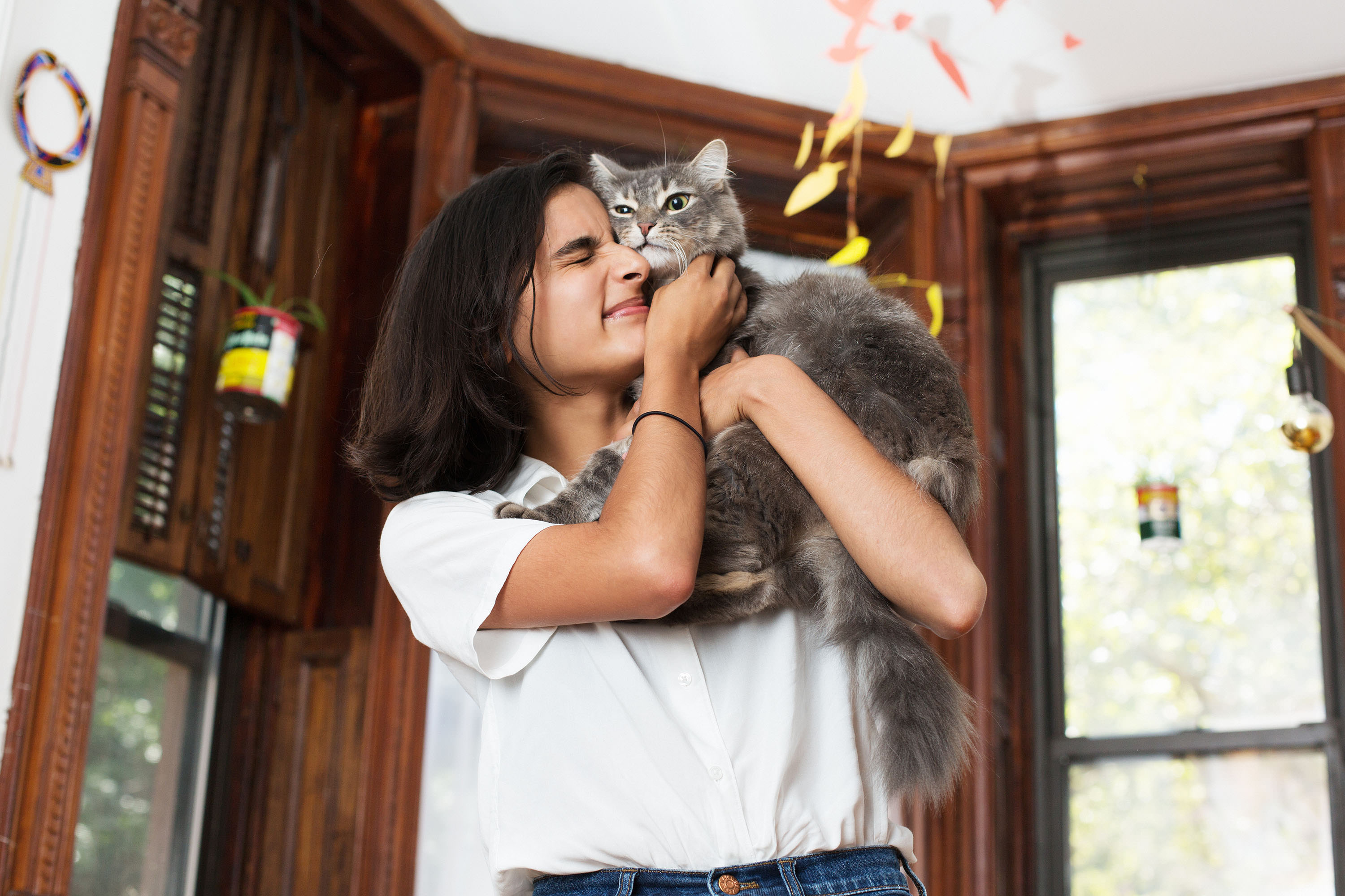
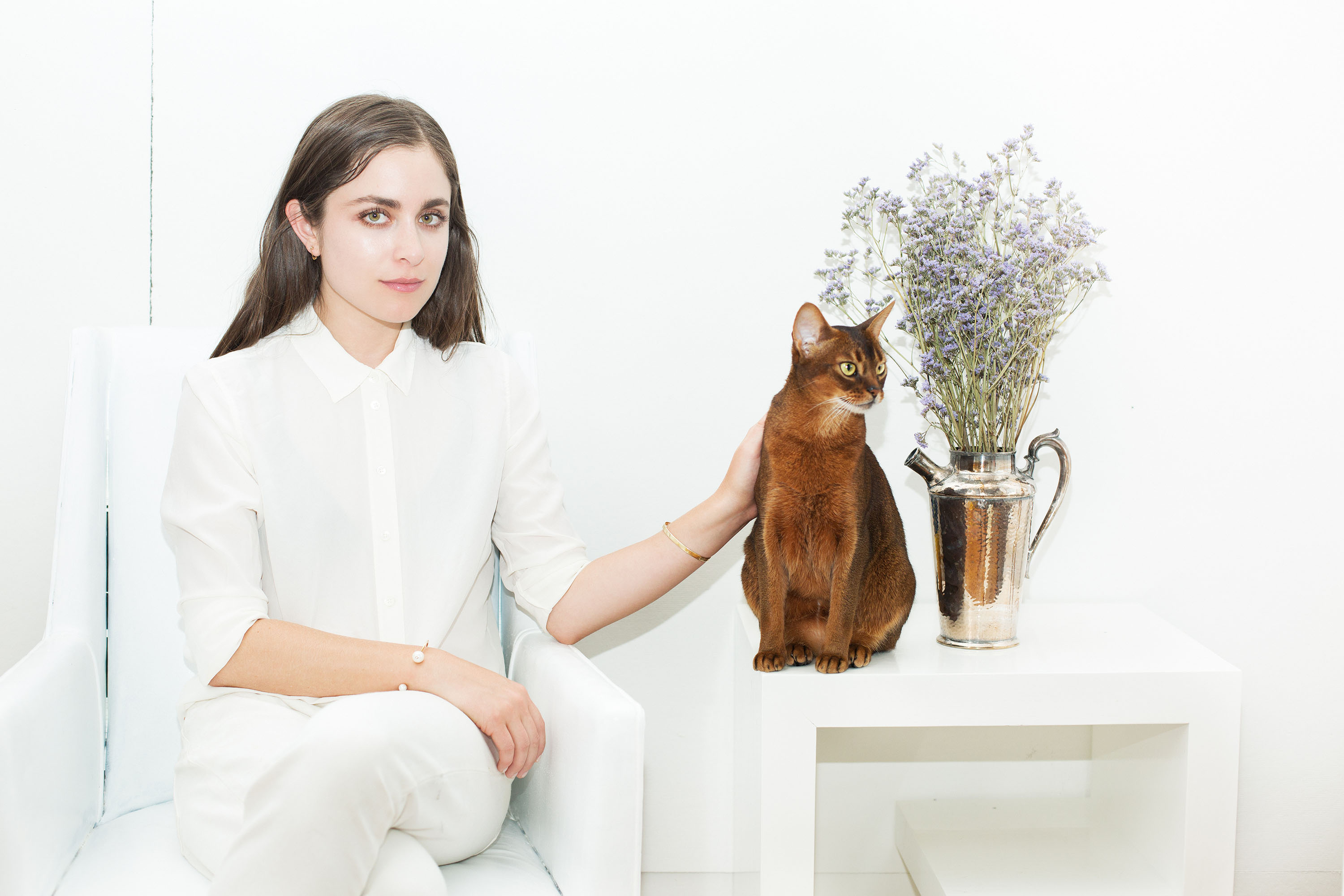
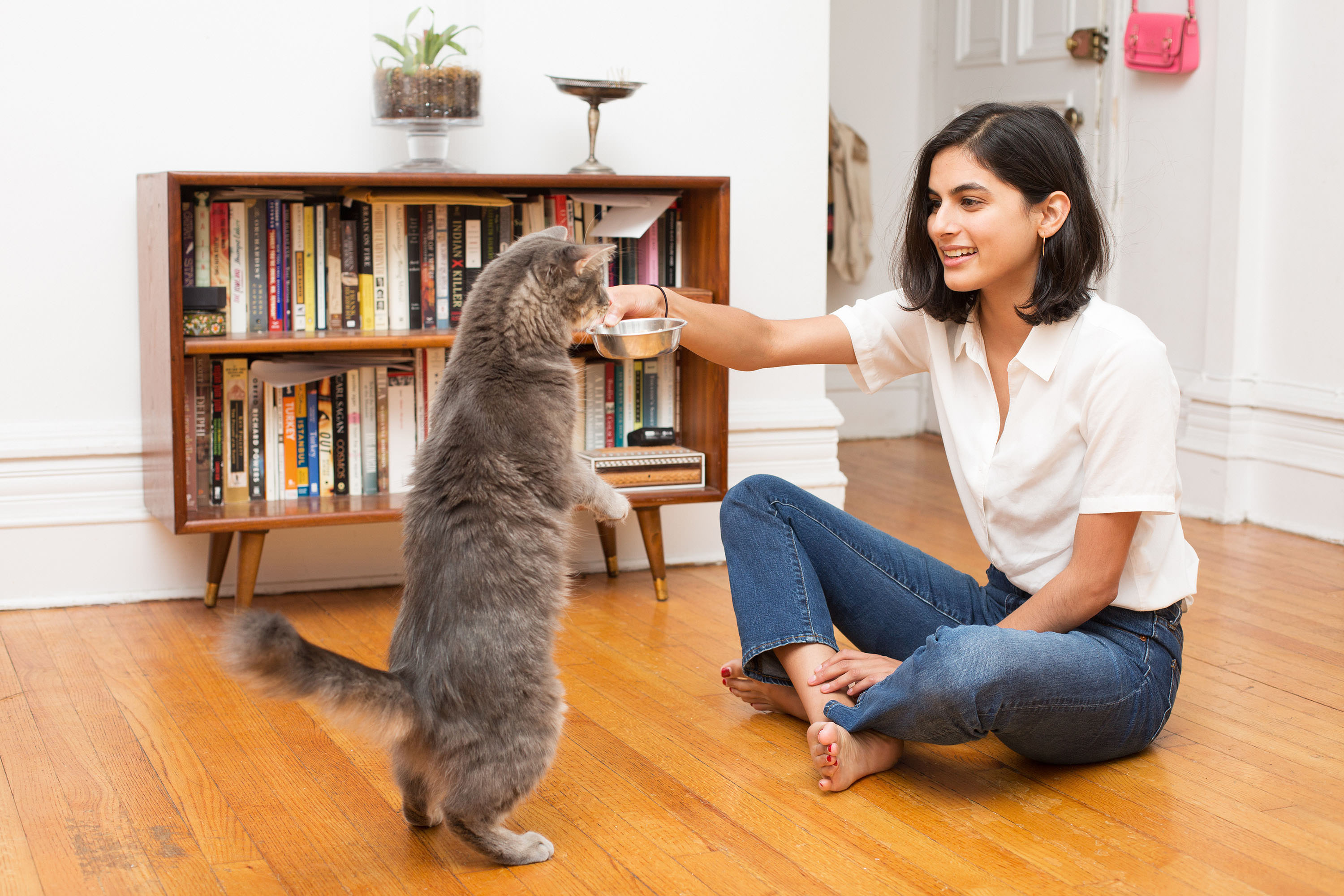
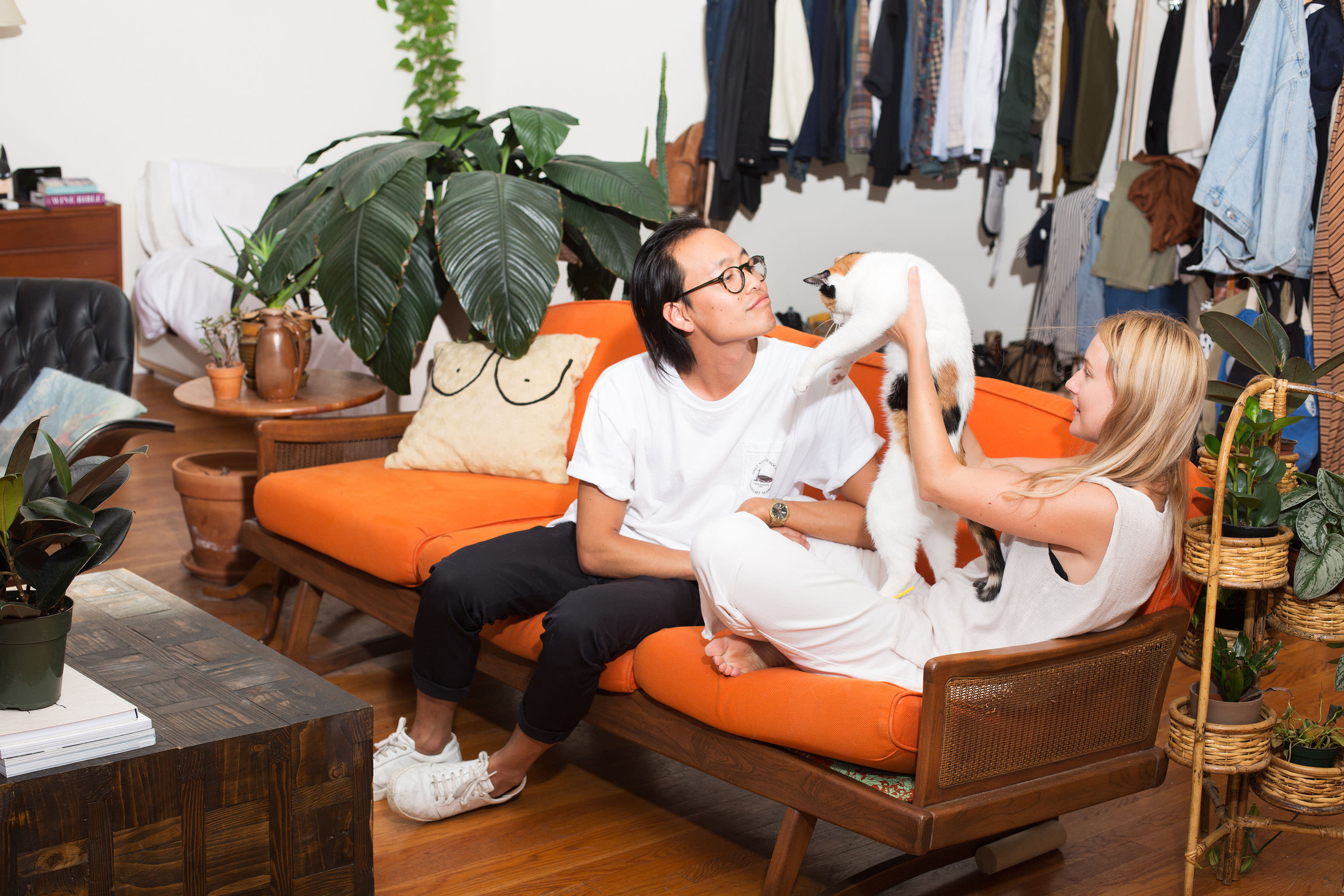
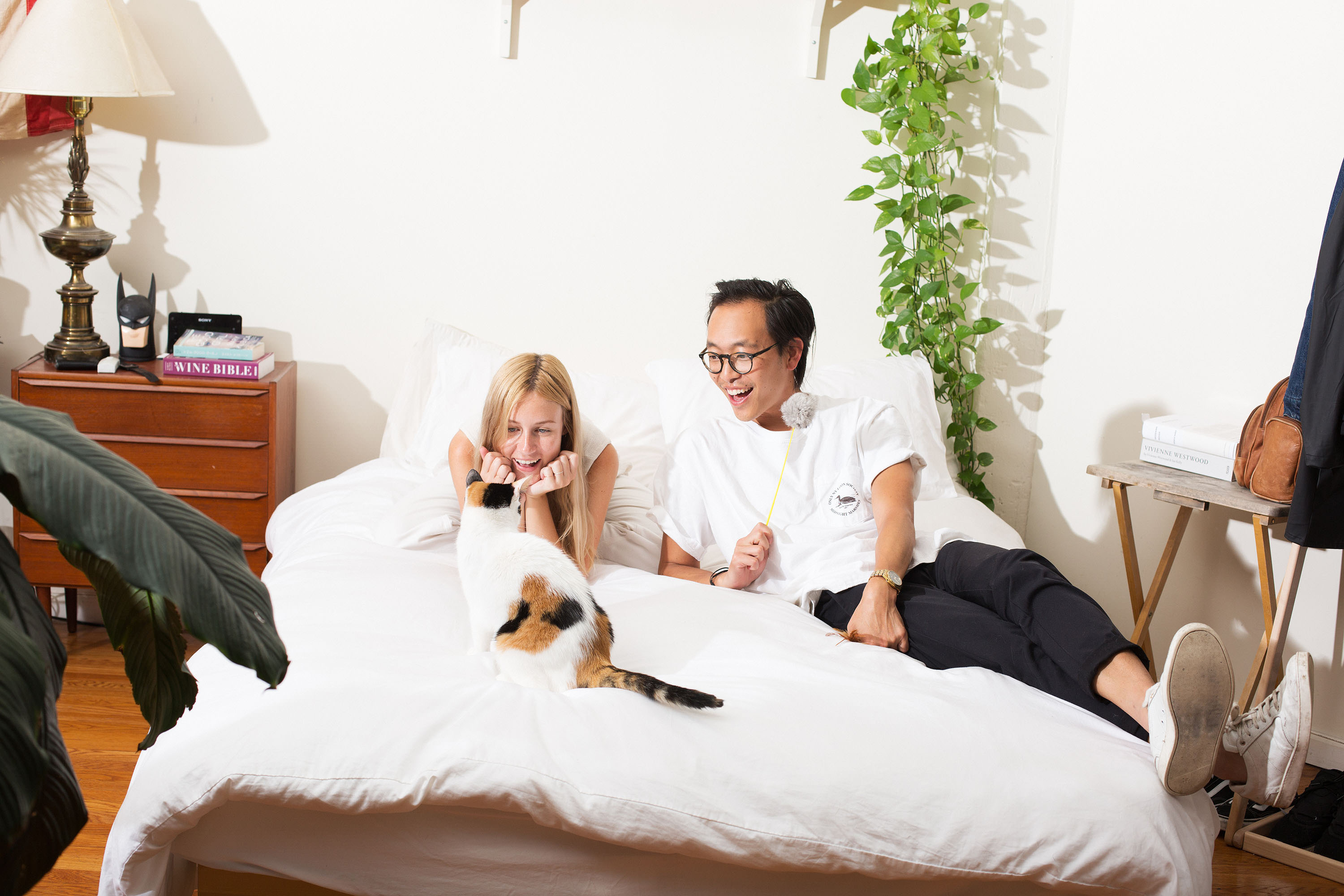
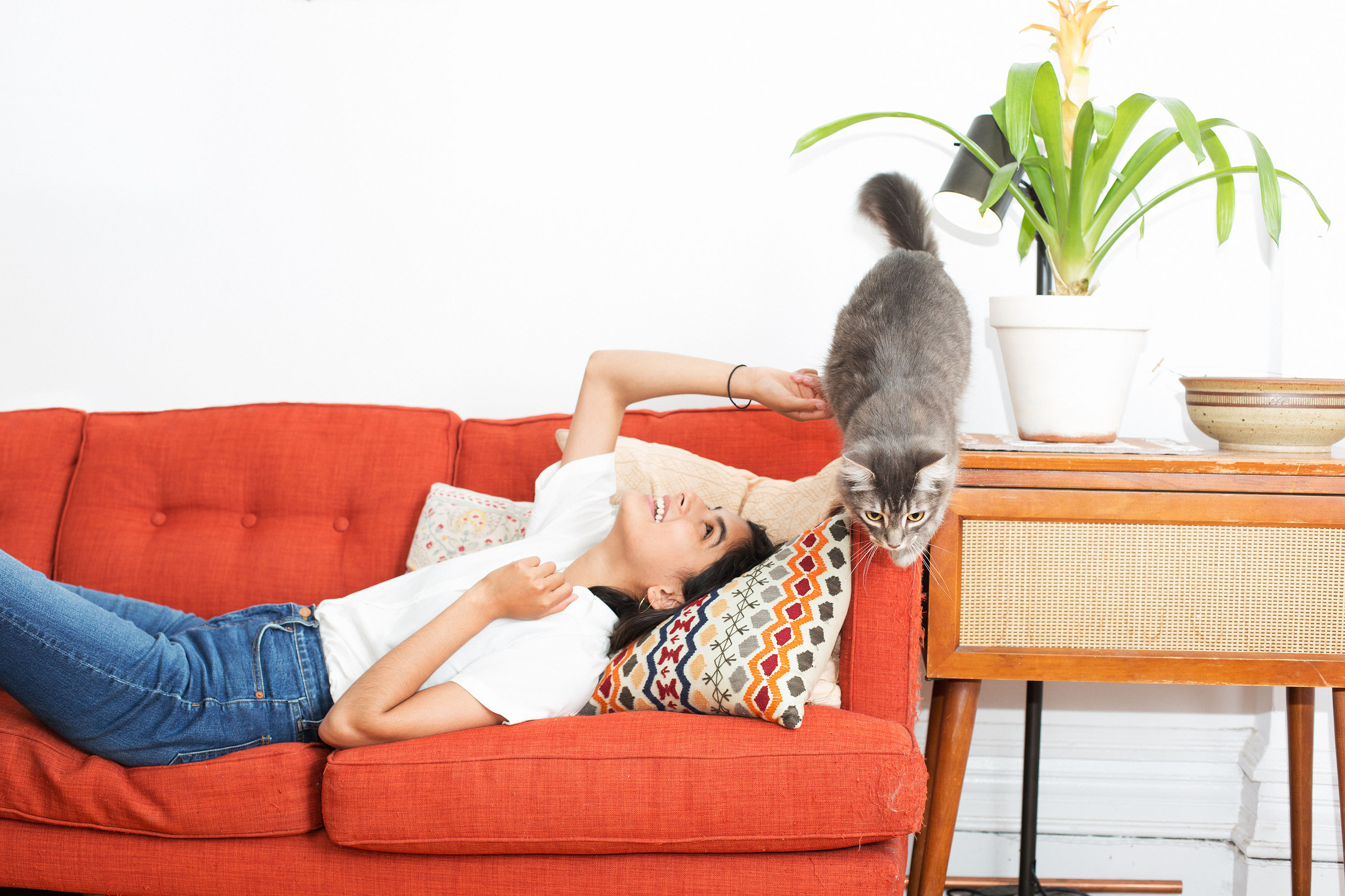
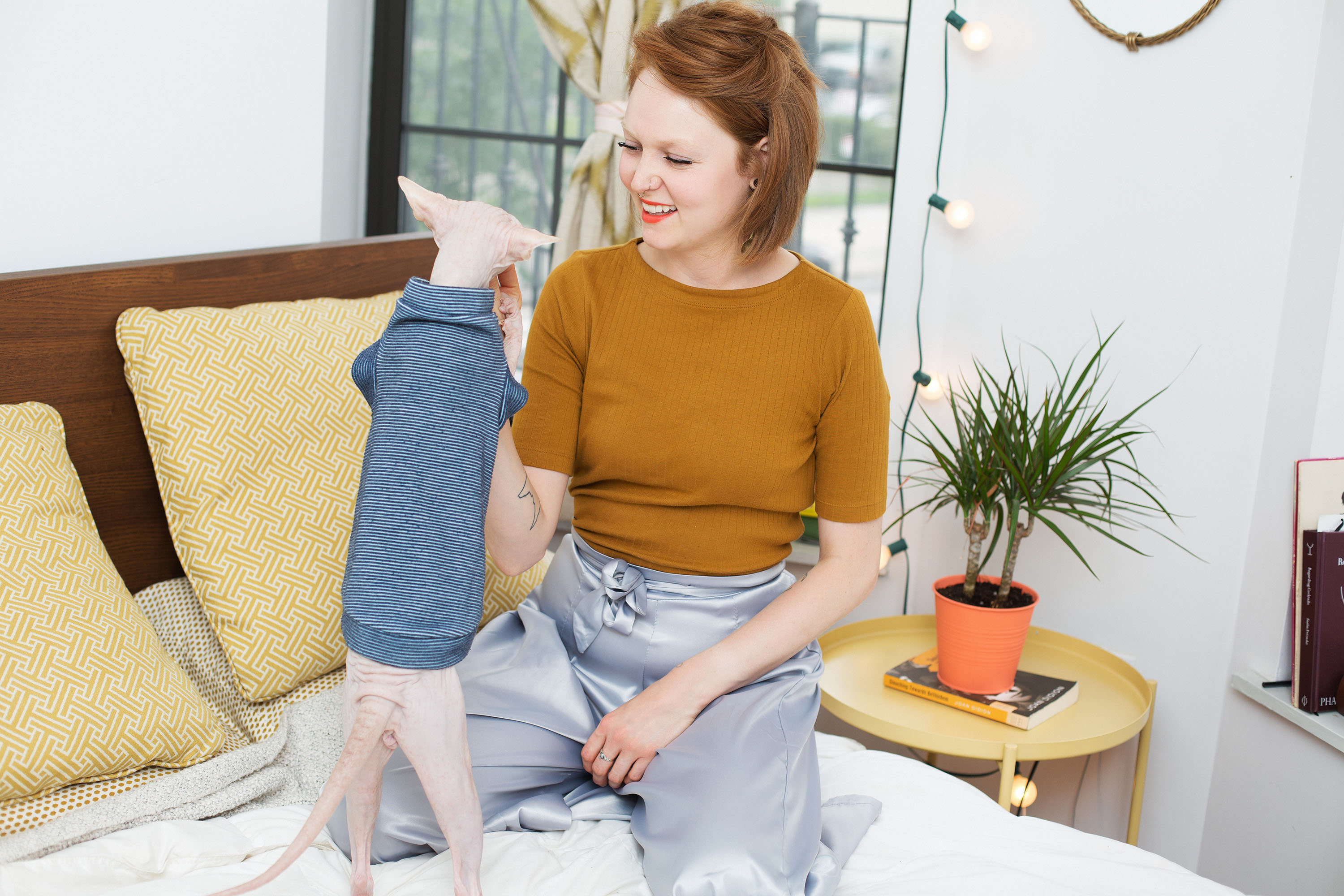
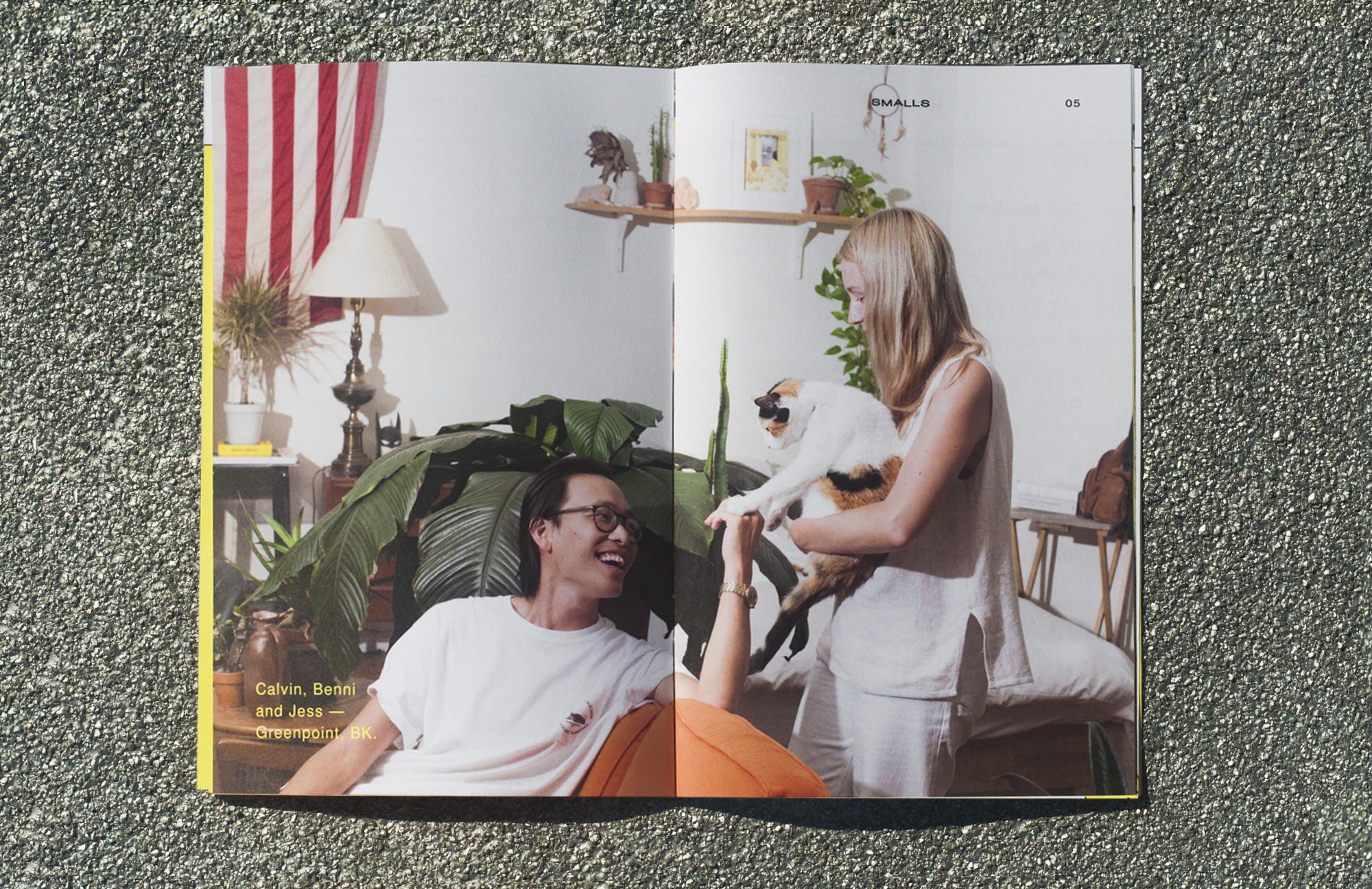
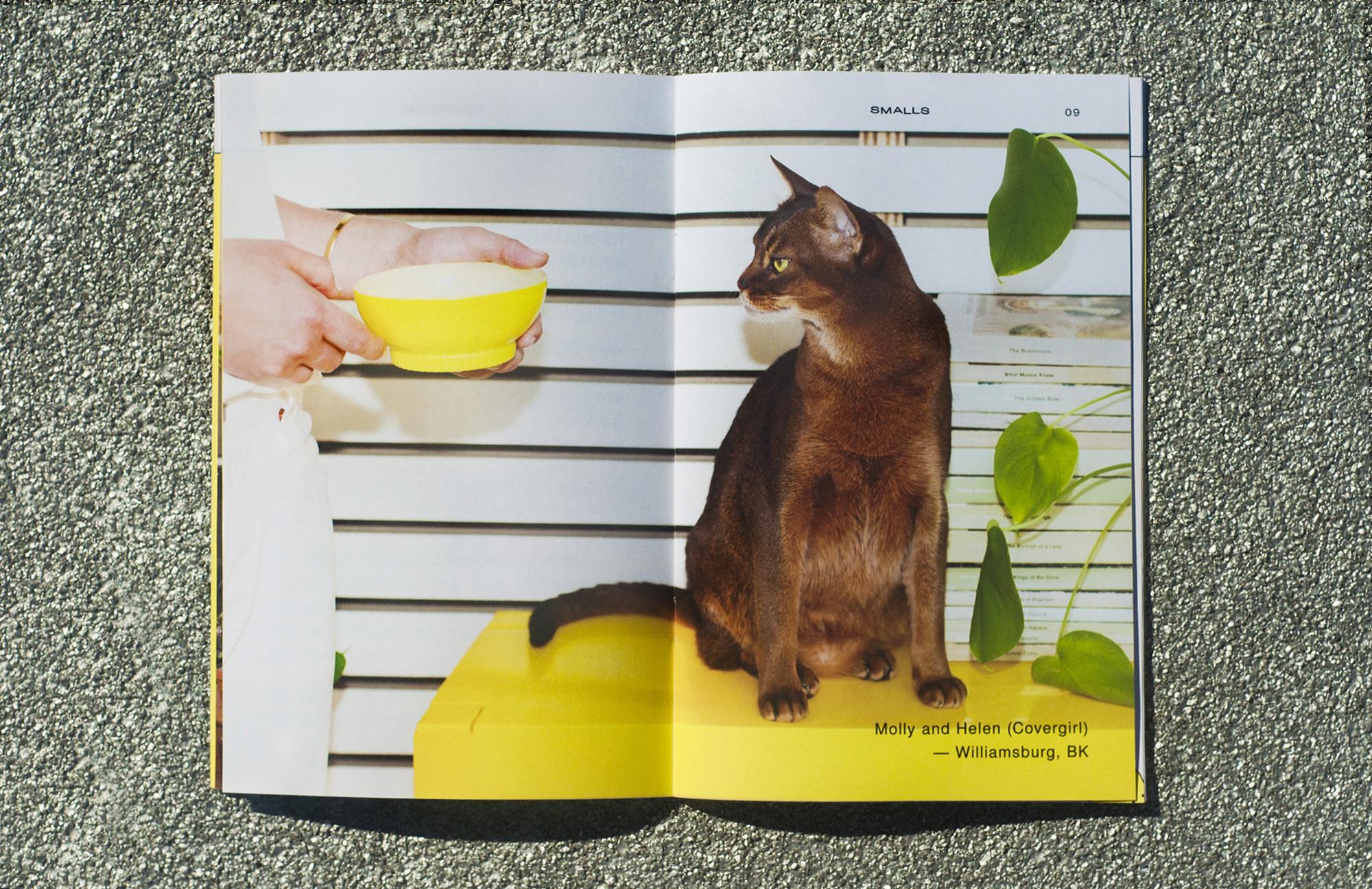
LIFESTYLE PHOTOGRAPHY
A series of straightforward close-crops with cats and their owners were shot to reference the intimacy of these relationships.
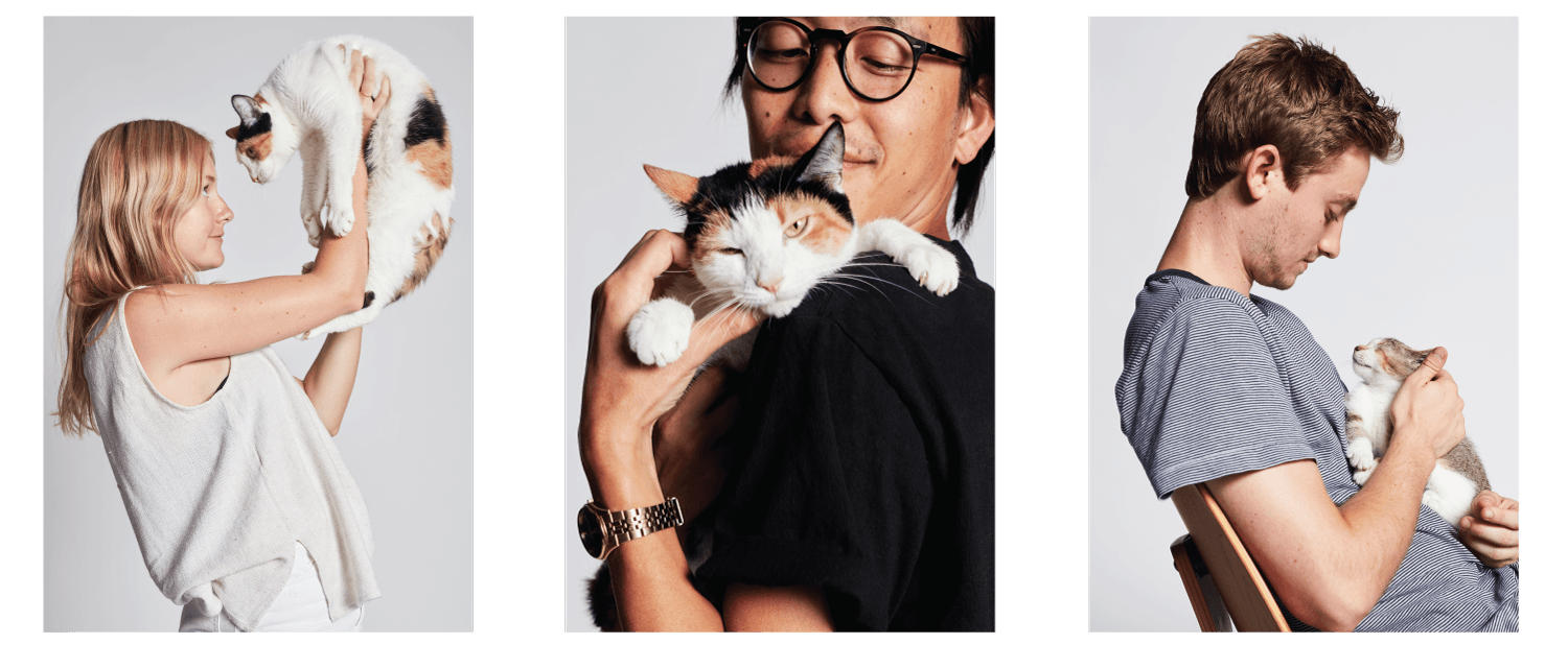
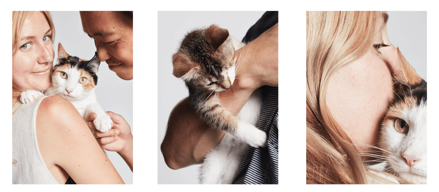
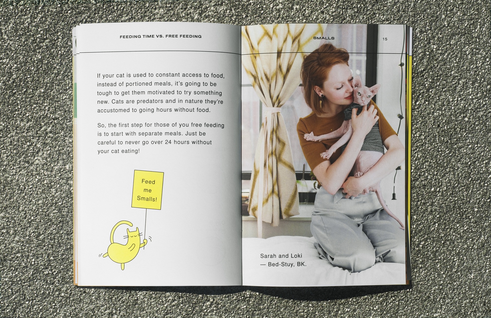
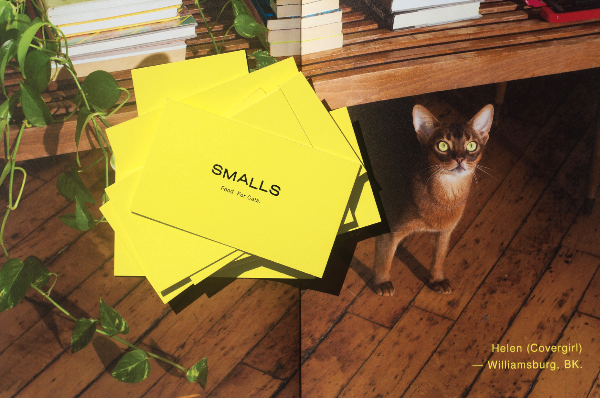
Shot by BriAnne Wills of GIRLS AND THEIR CATS, an ongoing series of lifestyle imagery has been created to document real cat owners in their actual homes within New York City — from Lower East Side to Greenpoint. The imagery was used throughout branded content, to help bring messaging to life and as a visual counterpoint to a series of real-life Smalls product reviews.
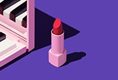
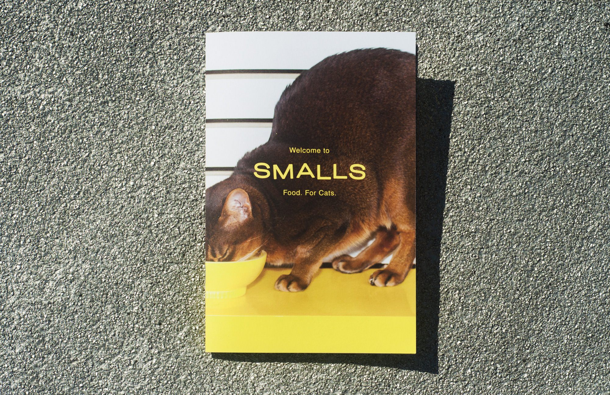
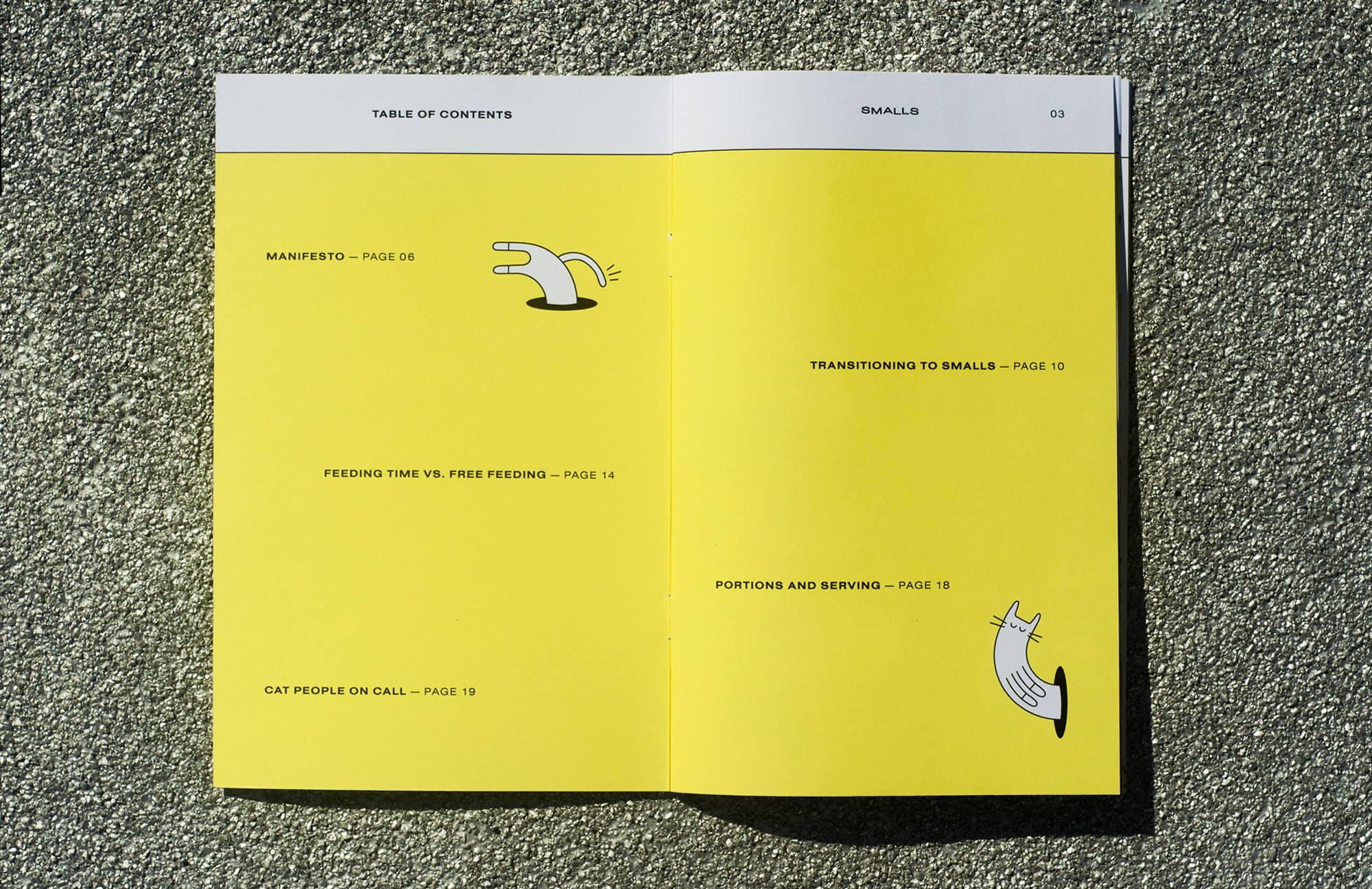
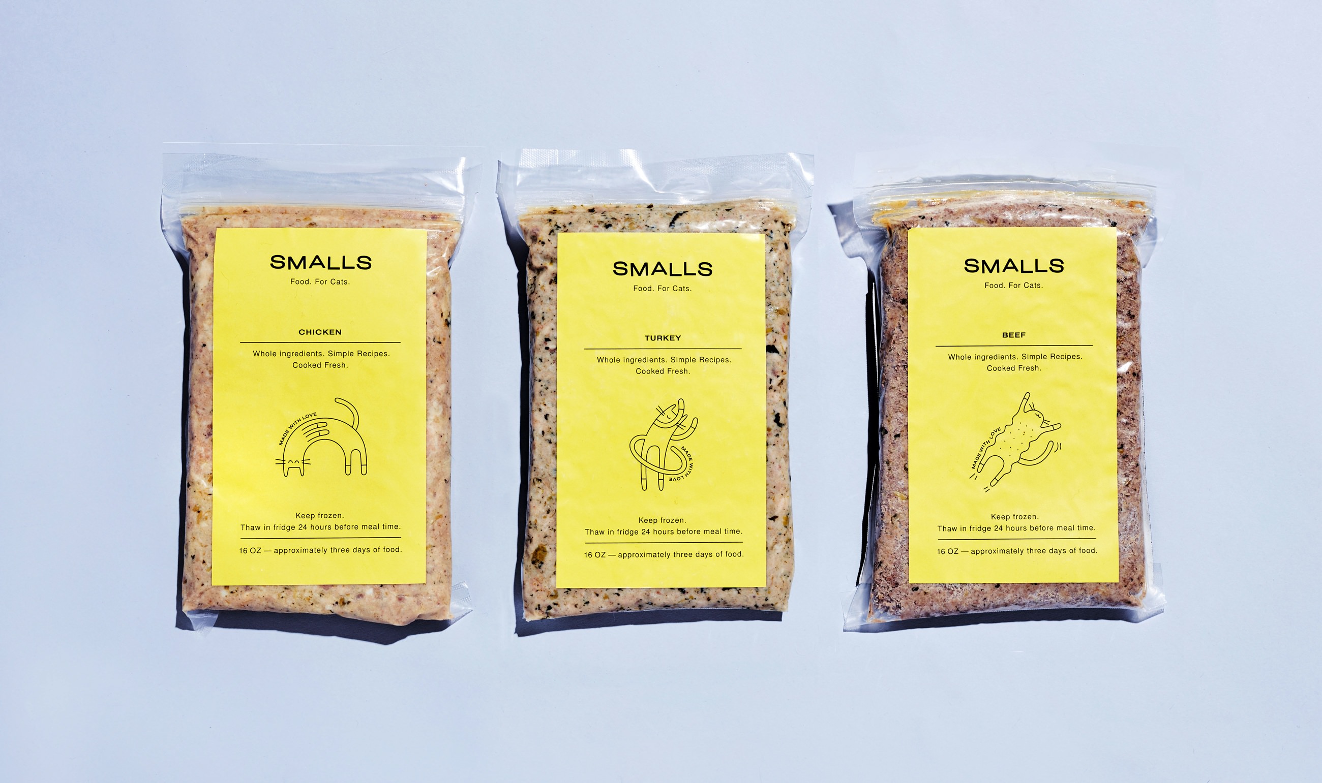
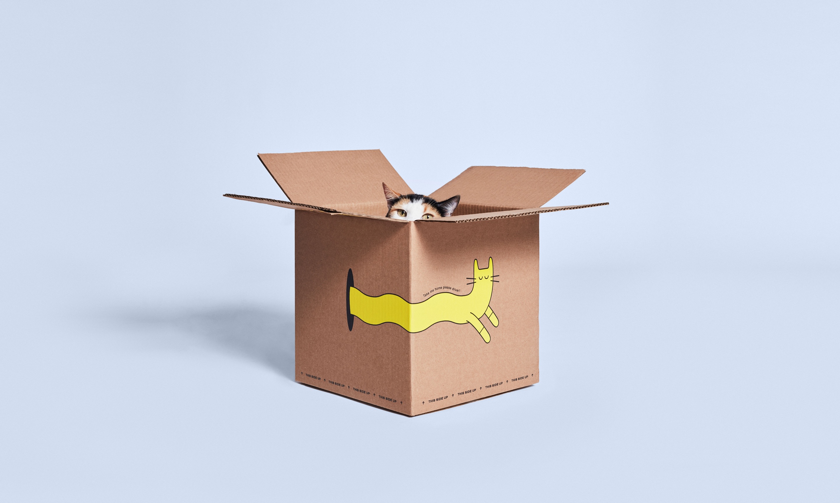
IN PRINT
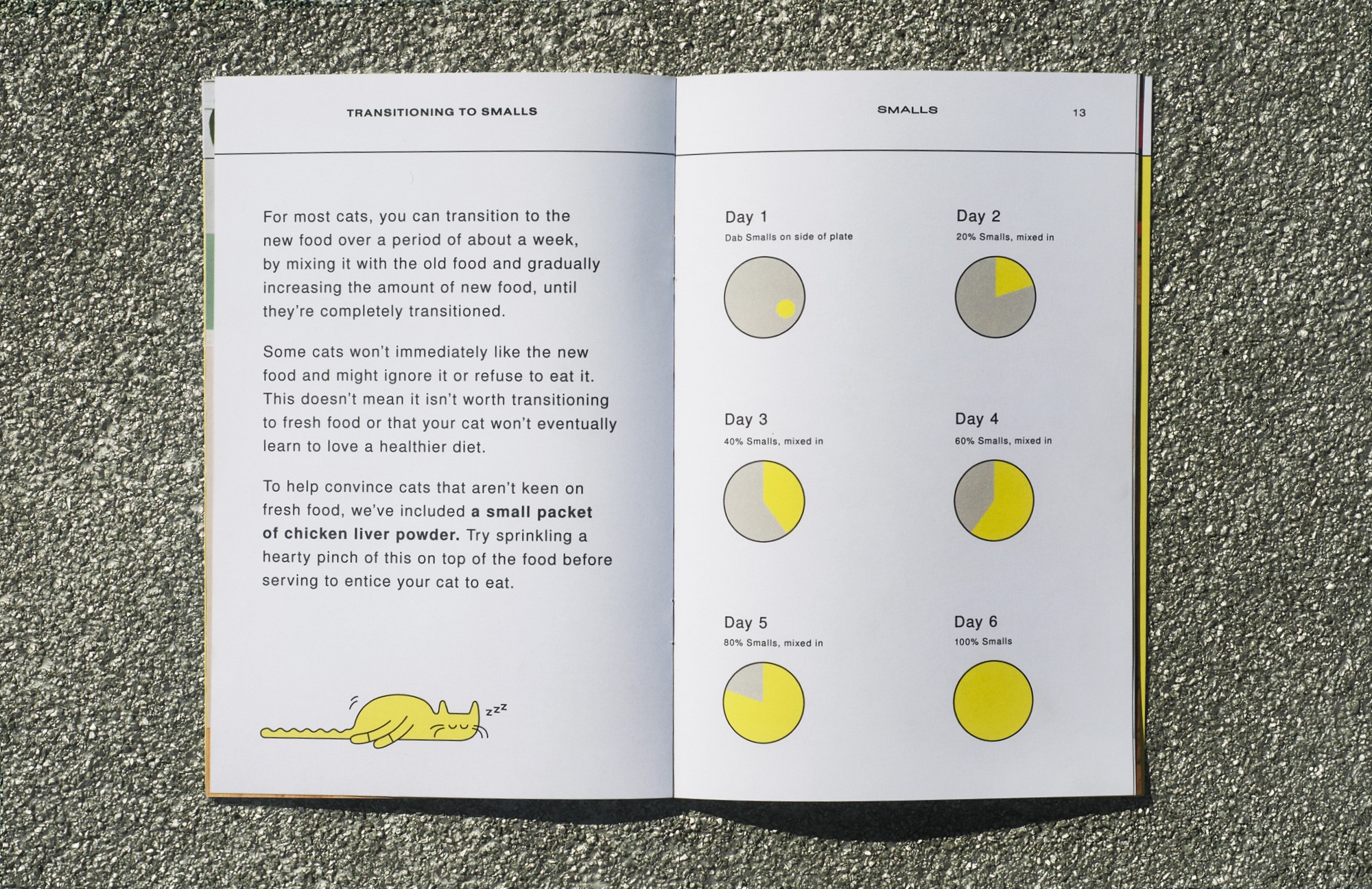
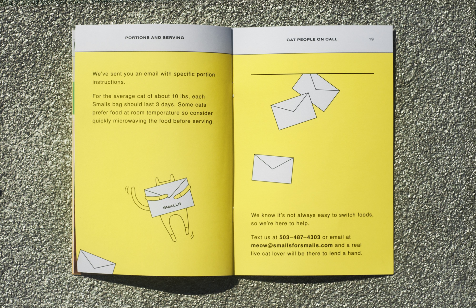
The Smalls voice is carried through from digital touchpoints, straight to the customer doorstep — with How-To booklets, branded shipping boxes and clear food packaging — all designed with a focus on clarity, transparency and where possible, a little fun.
Visit SMALLSFORSMALLS.COM to sign up now.
CREDITS
ROLE: SOLE DESIGNER, ILLUSTRATOR, ART/CREATIVE DIRECTOR
PHOTOGRAPHY: MOSSPARK & BRIANNE WILLS
DIGITAL STRATEGY: REBECCA ZHOU
CLIENT: SMALLS
STUDIO: INDEPENDENT
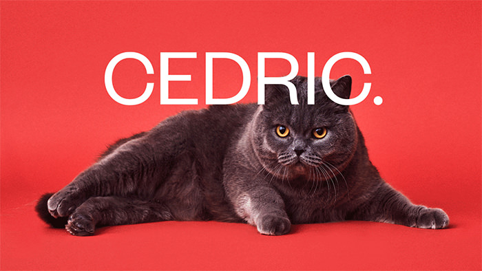
BEFORE SMALLS, THERE WAS CEDRIC.
The founders of Smalls approached me in 2016, to create temporary branding for their start-up venture, to help gain funding. The result of this was Cedric. While the branding and art direction was well received in user testing post-funding, it was also established that using a fat cat as the face of a cat food brand, might not be the smartest marketing strategy. RIP Cedric.
VIEW CEDRIC CASE STUDY